
1. Scan
The following principles will help you structure information for minimal cognitive effort.
Definition
Anchoring is a cognitive bias that cause users to rely too heavily on the first piece of information they are given about a topic. Users interpret new information from the reference point of their anchor instead of seeing it objectively.
Example
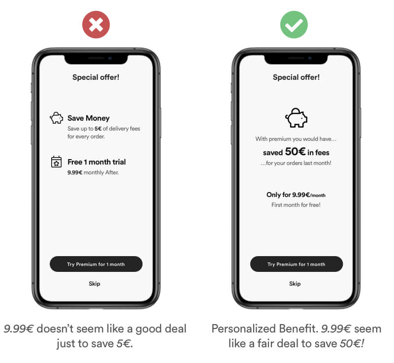
Set a user friendly and easy to understand anchor that underlines the – personal benefits – of your user. You communicate more value if you user understands the benfit. Buying premium for 9.99€ to save 50€ of order fees seem much more like a benefit that saving only 5€.
Real Life Example
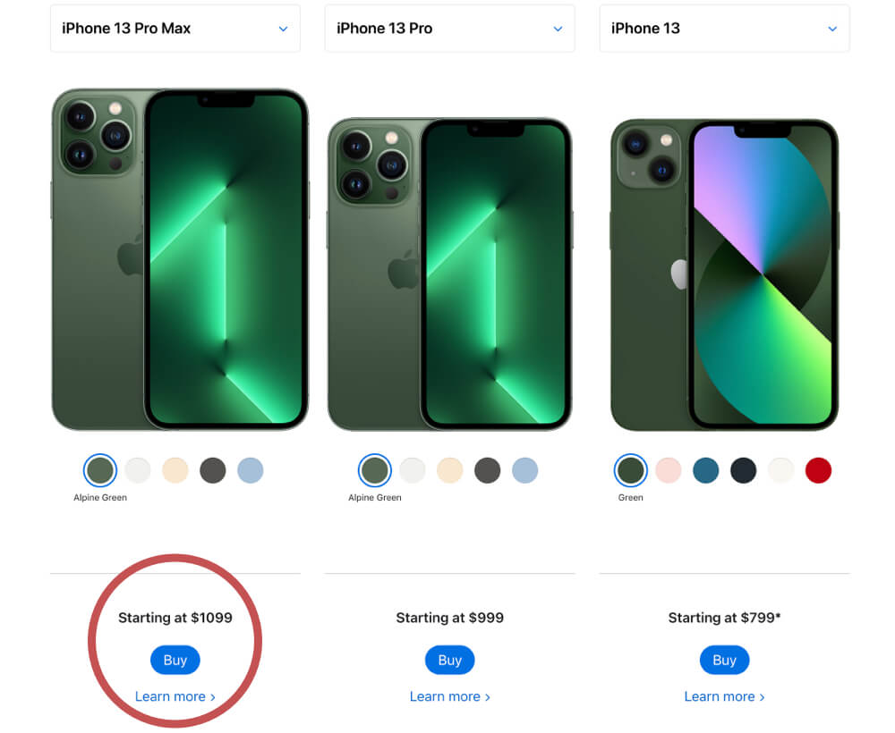
When comparing iPhone models, Apple is always using their most expensive item as an achor first. Every model after that seems like the cheaper option. Anchoring was one of the main reasons Apple introduced Pro and Pro Max versions of their products a few years ago. This was a psychological model to justify the price points of the regular models.
Tipps
- Do no fake high priced items to justify your discounts price.
- Show expensive items first, so every item after that seem like a good deal.
- You can show numbers unrelated to the initial product to influence the perception.
Definition
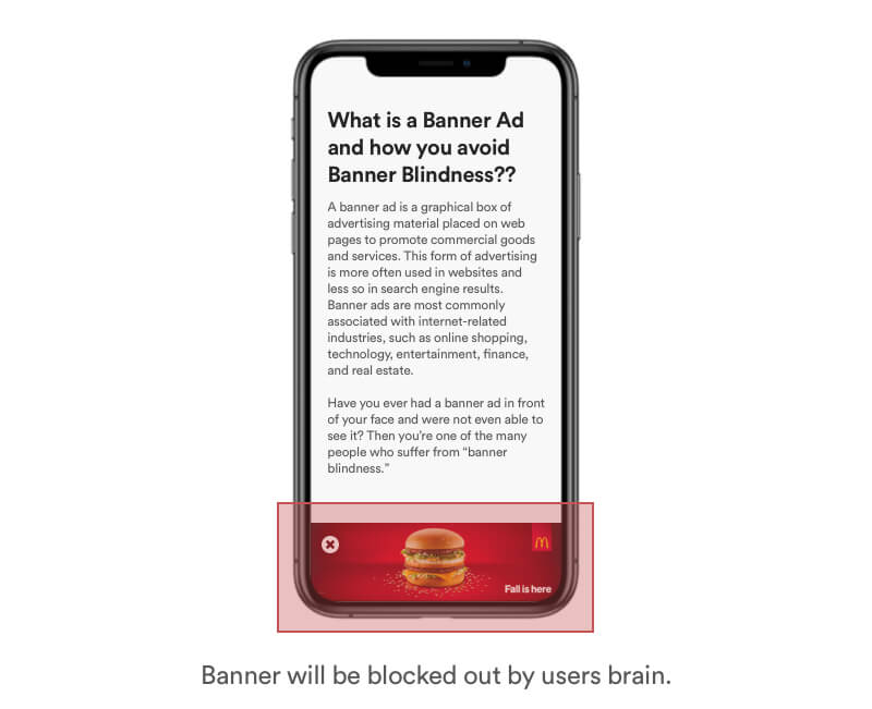
Banner Blindness describes users tendency to ignore page elements that they perceive as ads. While banner sizes and forms have evolved, banner blindness is still prevalent. Brains sort information and block unrelevant information.
Example
Advertising is everywhere. Online and offline. Our brain is trained to block out unnecessary information that are not important. Banners that are obviouly designed and placed will be blocked out of our perception.
Real Life Example
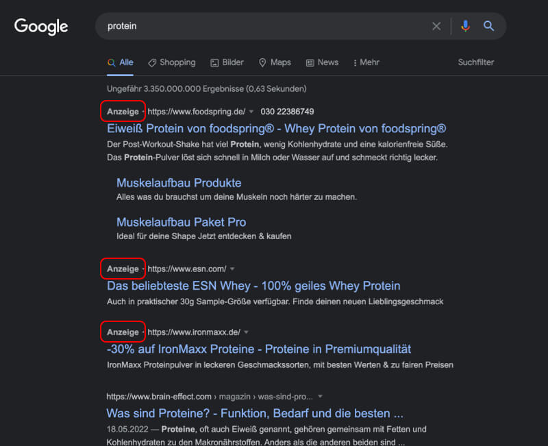
Google noted early on the negative effect of banner blindness. Therefore they designed their ads similar to search results and placed them as the top results with a little "Ad" badge.
Tipps
- Don’t place information close to ads
- Don’t make information look like an ad
- Use methods like „Anchoring, Priming & Personalization“ to avoid Banner Blindness
Definition
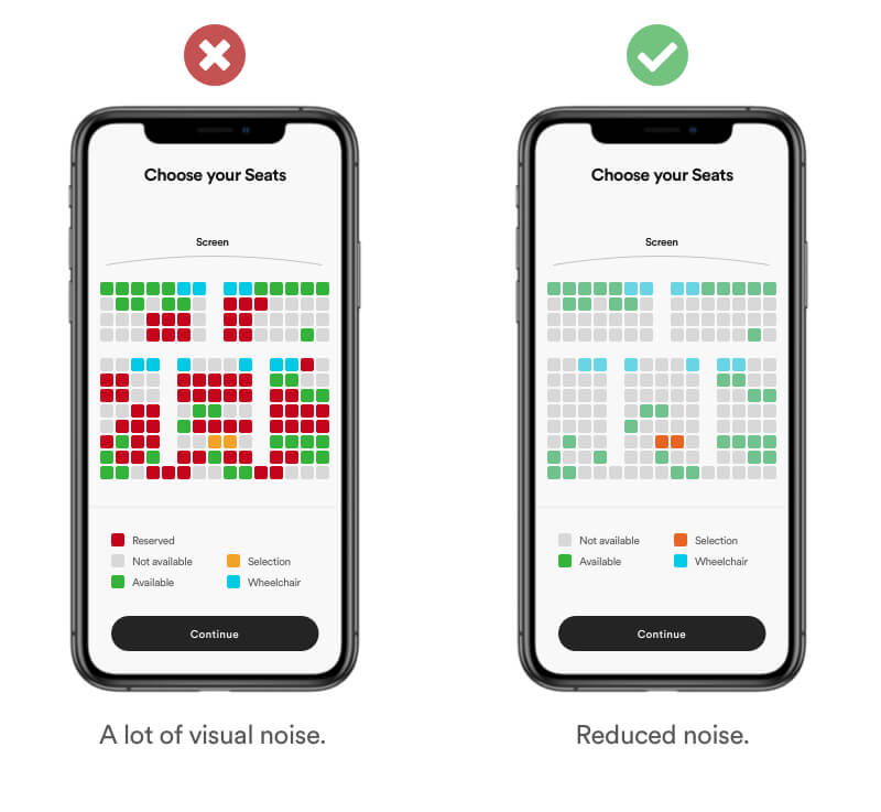
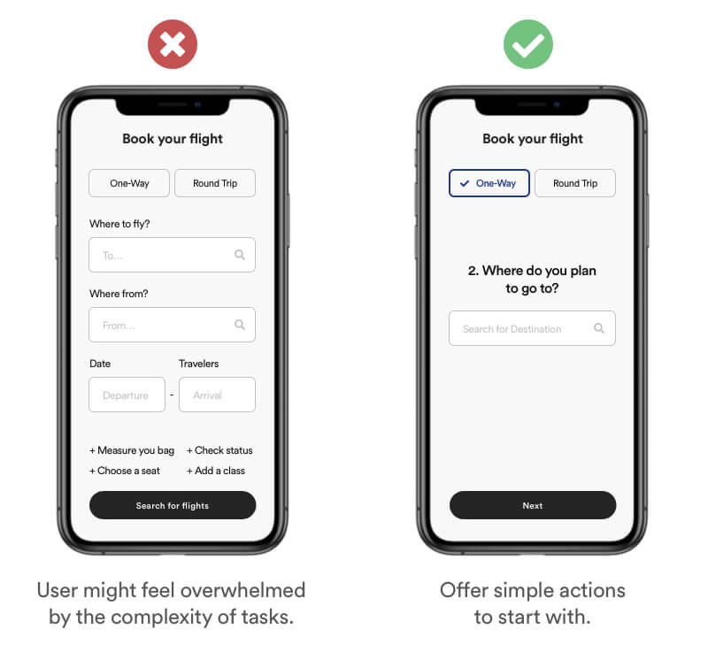
Cognitive load relates to the amount if information your working memory can hold at one time. The working memory has a limited capacity therefore you should avoid overloading it with additional activities that don’t directly contribute to learning.
Example
Reduce the amount of information and scrap unecessary items. Keep im mind your user has a clear goal in mind. You job is to make it as easy as possible for him to reach it. For example: You user is interested in selecting a "free seat". Therefore it's unnecessary information to show "reserved" and "not available" seats. Keep it simple. Reduce visual noice by showing not available seats in a neutral color while highlighting available ones.
Real life Example
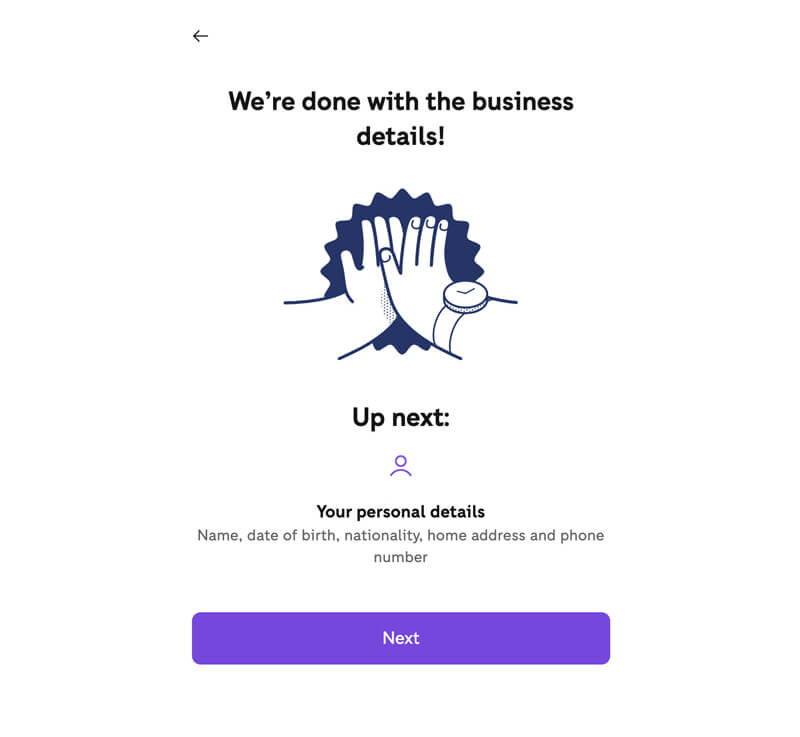
Zettle takes the long process of creating an account, and breaks it into steps. Then, between each step, they have feedback pages, which gives the user a chance to pause, relax and reset.
Tipps
- Keep it short and simple – Split steps when needed.
- The more information the heavier the cognitive load.
- Reduce visual noise using fewer and less saturated colors.
Definition
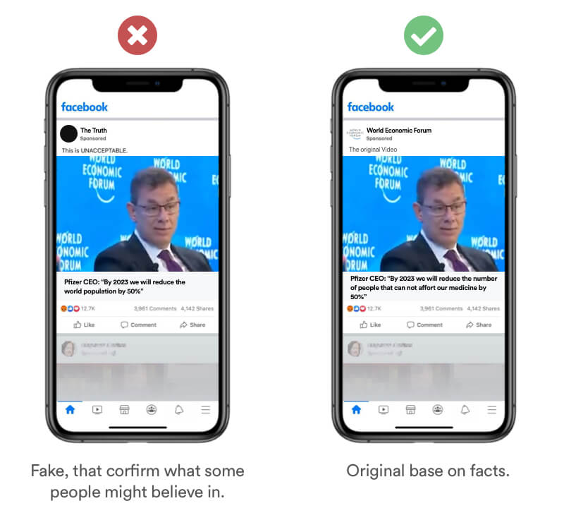
Confirmation bias is the tendency to process information by looking primary for information that is consistent with a users existing beliefs. This biased approach to decision making is largely unintentional and often results in ignoring inconsistent information.
Real Life Example
Fake News are very popular on Telegram because our brain loves information that conforms what we already believe. This bias is often abused by radical groups trying to spread fear with fake news based on what people might think they believe regardless of the facts.
Tipps
- Do not create fake news.
- Stick to facts and statistics.
- Provide source for your information.
- Double check the authenticity of your source.
Definition
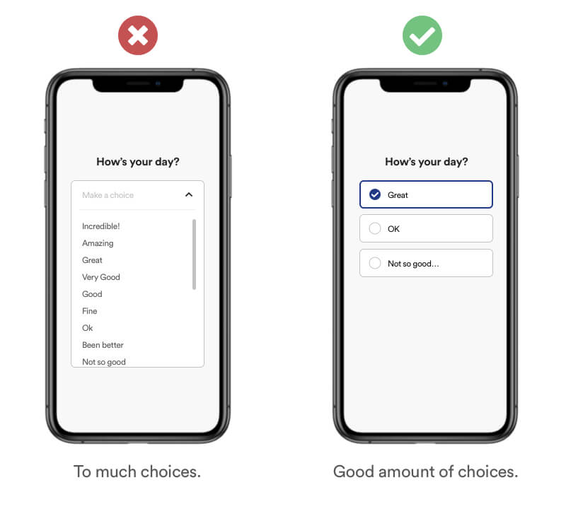
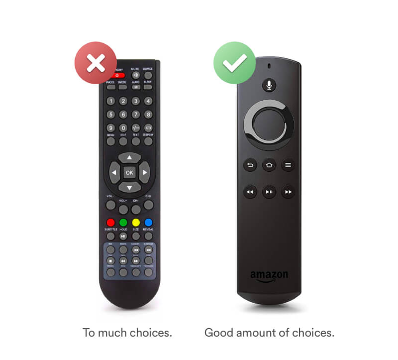
Hick's Law (or the Hick-Hyman Law) states that the more stimuli (or choices) users face, the longer it will take them to make a decision.
Example
You can already se an unneccessary amount of options which increase the complexity of making a choice. When showing information try minimizing the amount of options by hiding unneccessary options and focusing of the most important. In addition you can provide default options to nudge certain actions and minimize the cognitive load.
Real Life Example
Amazons remote is a great example. While old remote controls were overloaded with buttons the Amazon Fire TV remote scrapped all unnecessary Buttons and reduced the amount to a minimum of 7 to make it easier for the user to make a decision.
Tipps
- Reduce the amount and complexity of choices.
- Categorize & hide choices behind menus if possible
- If you can’t categorize them, make sure you put them into an order easy to quickly scan through
Definition
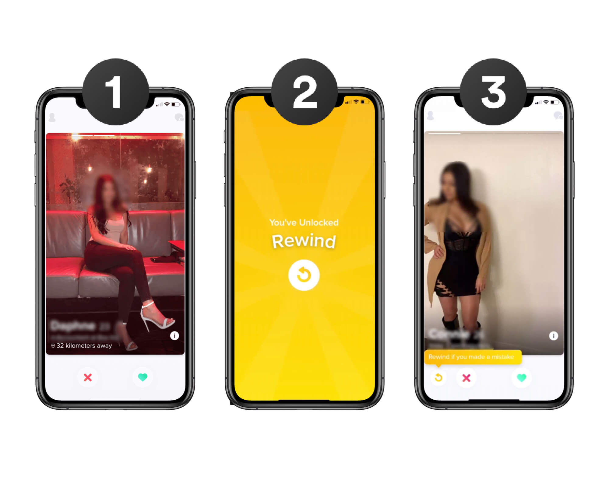
Progressive Disclosure is an interaction design pattern that sequences complex features across several screens. The focus is to provide the bare minimum of a product and reveal new features later throughout the process.
Example
Encouraging your user to complete simple actions before moving forward to more complex ones. This will lowers the chances that your user will feel overwhelmed before making the first action.
Real Life Example
The dating app Tinder is a great example of how to use this method. In order to not overwhelm new users, Tinder start with simple with the minimum functionality of "Like" and "Dislike". After a while tinder is introducing new features one by one. This way the user gets time to get used to the features for a while before being introduced to new & complex ones.
Tipps
- Reduce the amount of actions to reduce the chance a user will feel overwhelmed
- Show only a few features
- Reveal new and advanced features later
Definition
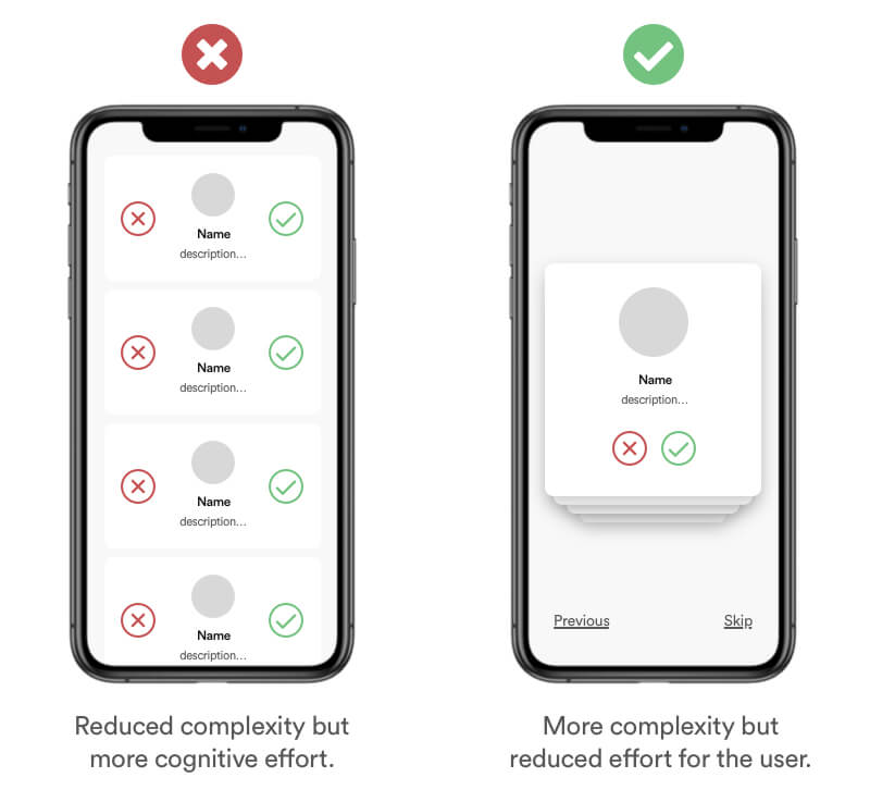
Tesler’s Law is also known as The Law of Conservation of Complexity. It states that for any digital product there is a certain amount of complexity which cannot be reduced. Doing so would automatically transfer complexity to the user.
Example
Try reducing the cognitive effort a user has to make why keeping the bare minimum of complexity for your product. While the list seems like the less complex example, it increases the user cognitive effort because the screen is filled with options and possibilities. Reducing the list and highlighting only 1 card at a time reduces the cognitive overload while keeping the complexity.
Tipps
- Increase the usability instead of minifying the process.
- Ensure to reduce the amount of complexity a user has to deal will.
- Don’t simplify to the point of abstraction.
Definition
The Von Restorff effect is also known as The Isolation Effect. It predicts that when multiple and similar objects are present, the one that stand out from the rest is most likely to be noticed & remembered.
Example
If you have various items that can be compared, making one element visually standing out by size, color and nudges can increase the awareness for that particular item.
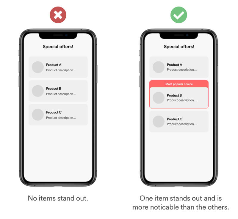
Real Life Example
This effect is commonly used on almost every e-commerce site that offers various plans. You can notice it that usually the plan in the middle is standing out. This effect is often combined with the biases Anchoring and Social Proof.
Tipps
- Make important elements stand out visually
- Don’t rely one color only. Use size, form and value to create contrast.
- Avoid repeating patterns (Law of Similarity).
2. Understand
Definition
The decoy effect describes that when we are choosing between two options, the addition of a third, less attractive option in the middle (the decoy) can influence our perception of the original two choices.
Example
Add a third (middle) option as a reference point to increase the number of options. A Users will automatically use the middle option as reference to choose the best option that fits his needs. I this case the benefit is easy to understand. The large option is doubled the size compared to the medium sized but not double the price!
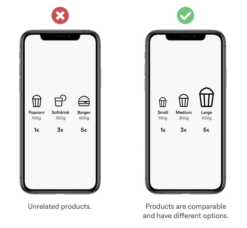
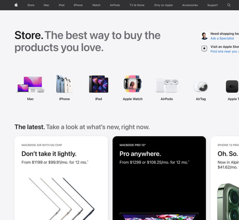
Real life Example
When comparing Apple products they usually show up to 3 products and use a selected middle product as reference. For example: The middle product costs 200$ more than the cheaper option. But the expensive product costs only 100$. Therefore the it seems like a good deal to choose the expensive product.
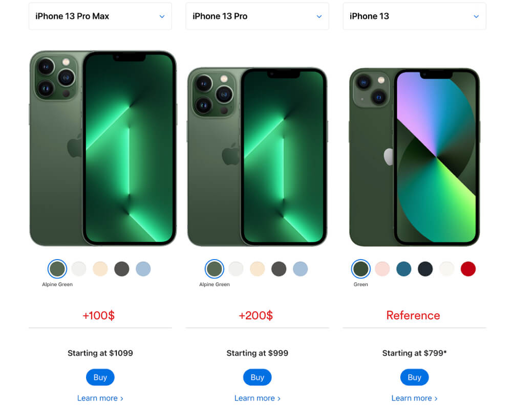
Tipps
- Do not provide false information.
- Do not try to frame by adding irrelevant options/prices.
- Make it easy to compare.
- Show items that are related.
- Be transparent and let your user decide whats the best deal „for the user.
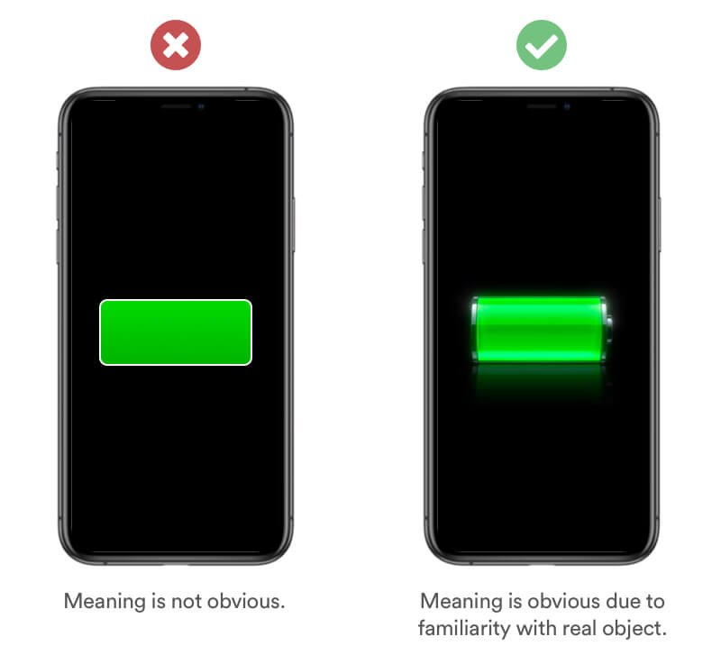
Definition
The Familiarity effect (or mere exposure effect) is a psychological phenomenon by which users tend to develop a preference for things or people that are more familiar to them than others. Repeated exposure increases familiarity.
Example
Familiarity is based on the experience and believes of your users. Use a design that is familiar to your user and makes the concept easy to understand. Using a 3D Model of a real battery makes the meaning to the user obvious.
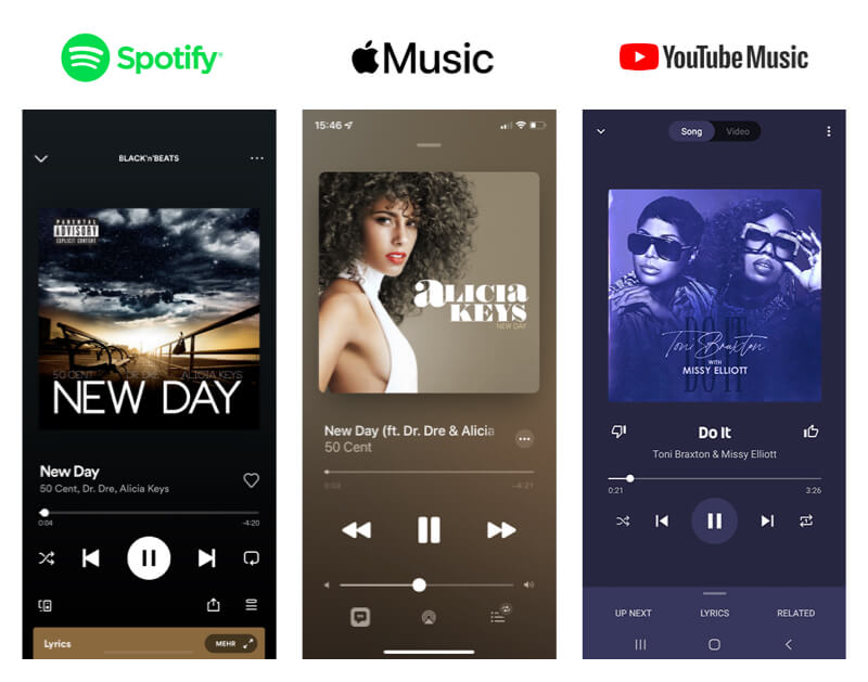
Real Life Example
Digital product like Spotify, Apple Music and many more create similar interfaces to provide their users a familiar experience.
Tipps
- Adapt to your users previous experiences
- Use objects from the real world
- Use similarities
Definition
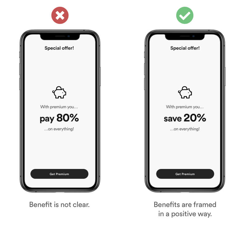
Framing is a cognitive bias where users choice is influenced by how the information is presented and worded rather than by the information itself. The same type of information can be perceived different by the way it's framed.
Example
Set a framing that makes it easy for your user to understand the benefits. Paying only 80% or saving 20% might be the exact same type of information. Yet „save 20%“ is perceived as the more beneficial choice.
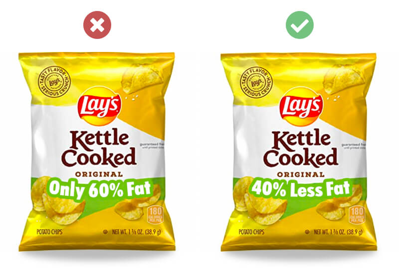
Real Life Example
Framing is a common bias used in the food industry to frame benefits of new products. You have the exact same information, yet you perceive it different.
Tipps
- Focus on the benefit
- Use positive and emotional wording
- Keep it simple
Definition
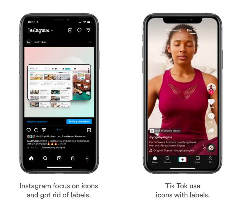
Users will tend to interpret and remember complex images as the most simple form possible because it Is the interpretation that requires the least cognitive effort.
Example
Use simple forms and shapes that are easy to understand and to remember. Help your user to minify information. The hearth on the left screen might be the anatomical right way of a heart. In the product world your user needs to much cognitive effort to store the details. Therefore you mostly see icons in digital products.
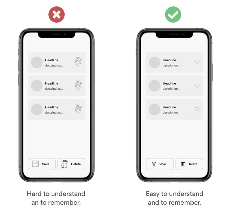
Real Life Example
Most digital products like Instagram and Tiktok completely rely on simplified icons as navigation elements. Those icons are learned symbols that imply certain functionality – "Mental Model" –. Some of them don't even use labels which I personally wouldn't recommend due to less accessibility.
Tipps
- Do not overwhelm Users with information and complex imagery
- Use simplified icons and forms rather than complex images
- User will automatically simplifie complex shapes into single unified shape
Definition
The Law of Similarity is the gestalt grouping law that states that elements that are similar to each other tend to be perceived as a unified group. Similarity can refer to any number of features, including color, orientation, size, or indeed motion.
Example
Use patterns and a consistent design language to make it easy for your user to identify elements that are similar. Due to the consistent use of patterns you make it easy for your user to identify the functionality behind and element and increase the usability overall.
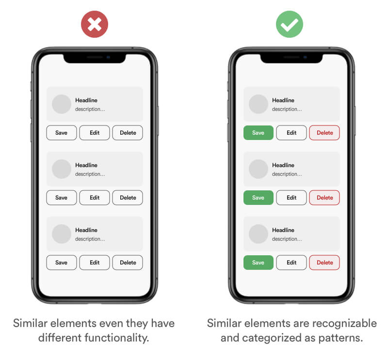
Tipps
- Use the same layout patterns for elements that are similar
- Make sure interactive elements are visually different from non-interactive elements
- Be consistent with your design decision throughout the project
Definition
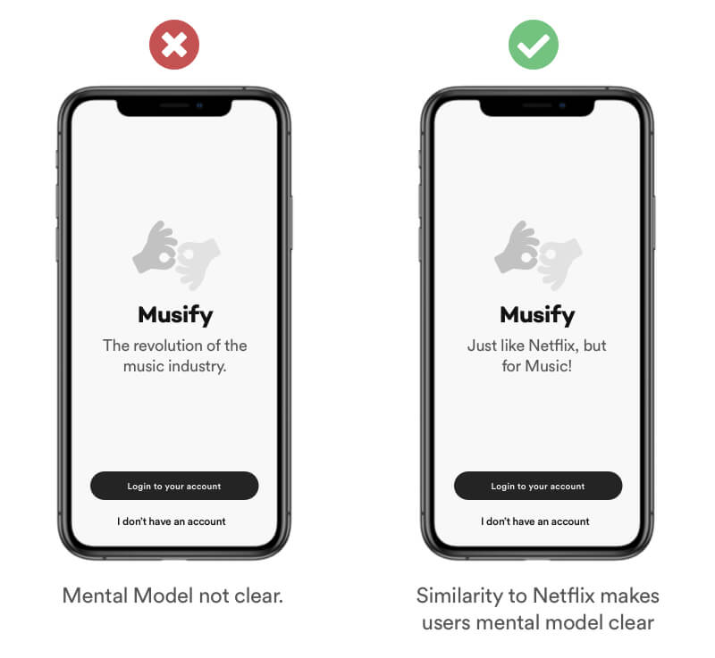
A mental model is an explanation of a users though process about how something works. Users tend to use conclusions based on their experience in the real world and have a predefined idea about their actions and the possible consequences when they use your product.
Example
Emphatize with your users and help them to understand your product/service. The left screen might indicate that the product has something to do with music. But at the same time it opens up new questions like: "How does it work?". Give your users hints for example a simple introduction that makes a similarity to netflix. Most users understand the concept of netflix. Therefore it helps your user get the mental model of the product without seeing much of it.
Tipps
- Persuade users by comparing your product/service. (Spotify - Just like Netflix but for music)
- Use objects & behaviors of the real world and adapt them into your product
- Be aware of what users tend to expect before using your product
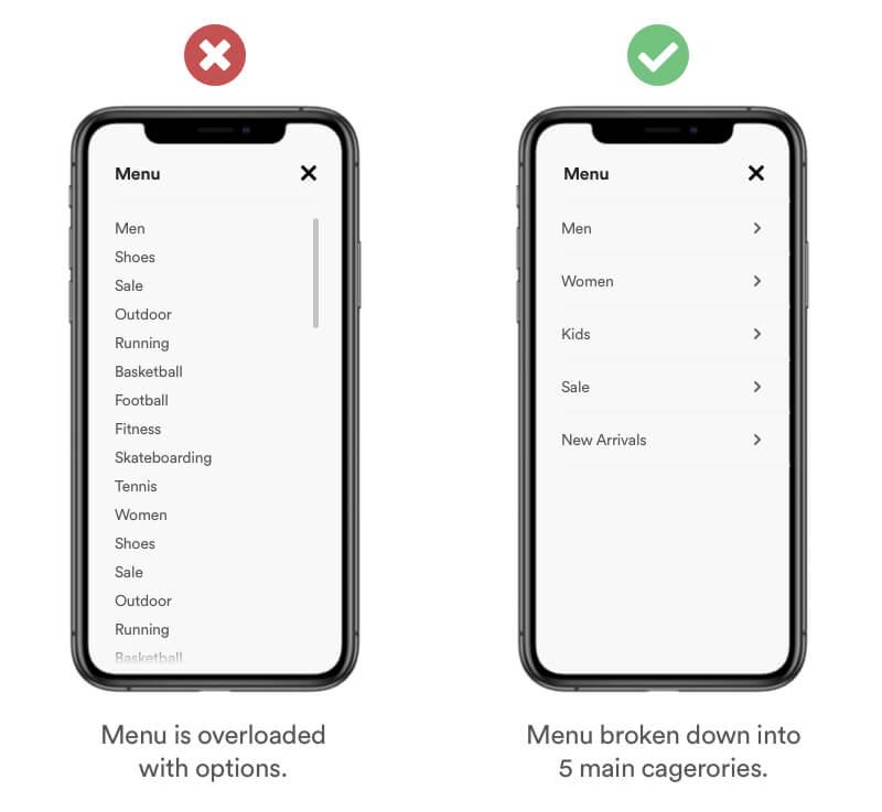
Definition
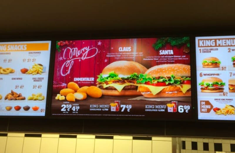
Miller’s Law states that the number of objects or pieces of Information an average person can hold in working memory is about 5-7. Also known as the Magical Number Seven. In case your users need to make a choice, break down the information and group it into chunks. Works well with ⏱ Hick's Law.
Example
A common mistake is overloading menus and lists with various items and options. Design for your users short-term memory. Reduce the amount of options and cagetorize them into a maximum of 7 options. Users will have it much easier "remembering" the categories.
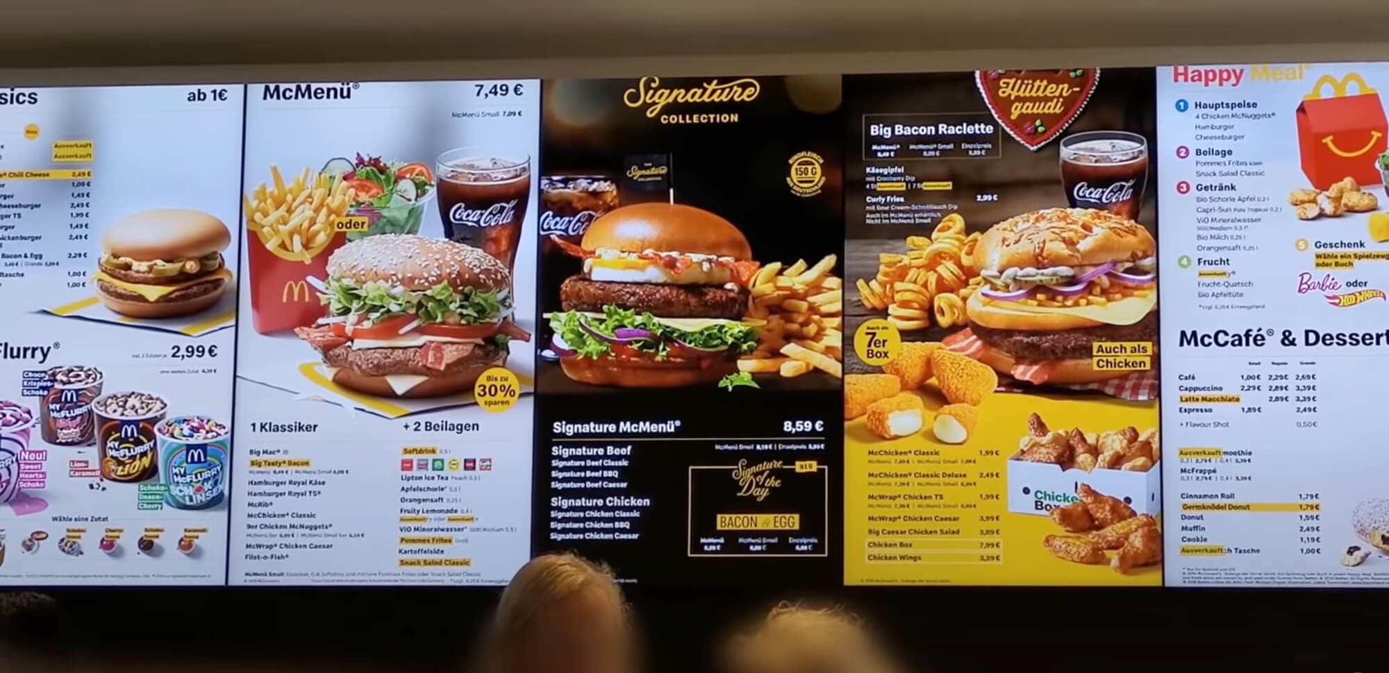
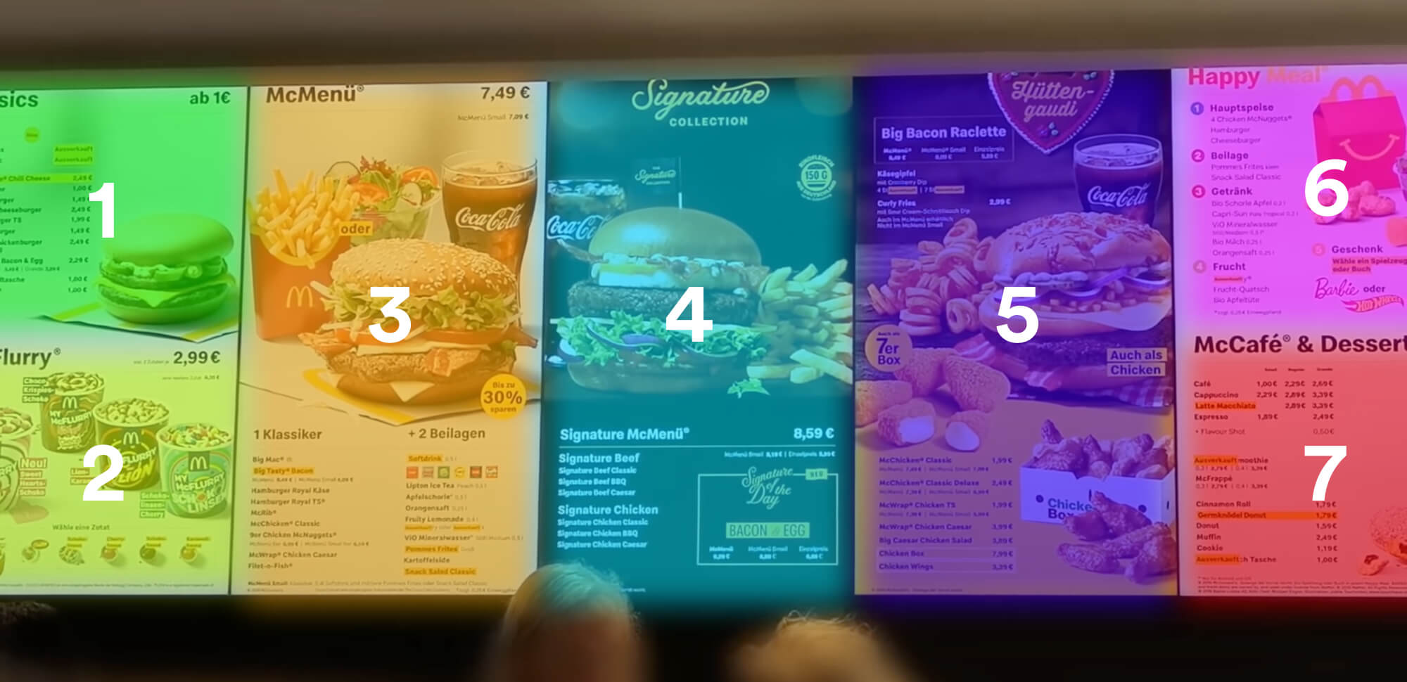
Real Life Example
Fast Food restaurants are using this method to prime centain items on the menu. They using 7 focal points on their displays so their user can hold those items in their working memory and not get overwhelmed with options.
Tipps
- Design for users short term memory – Don’t make me think
- Reduce information and organizing it into smaller chunks
- Reduce the amount of choices to a maximum of 5-7. (Don’t need to be exactly 7)
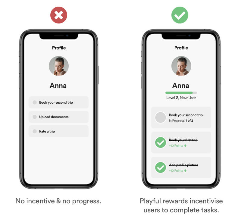
Definition
Pseudo-Set Framing is a psychological method used to motivate users to complete a task. Humans naturally find complete, cohesive units to be symbolic and meaningful, so they strive to achieve them.
Example
Visualize incomplete task in a way thats simple and easy to understand. Users have a feeling of satisfaction when completing simple and chronological tasks like 80% out of 100% rather than complex tasks like 9.6km out of 12km.
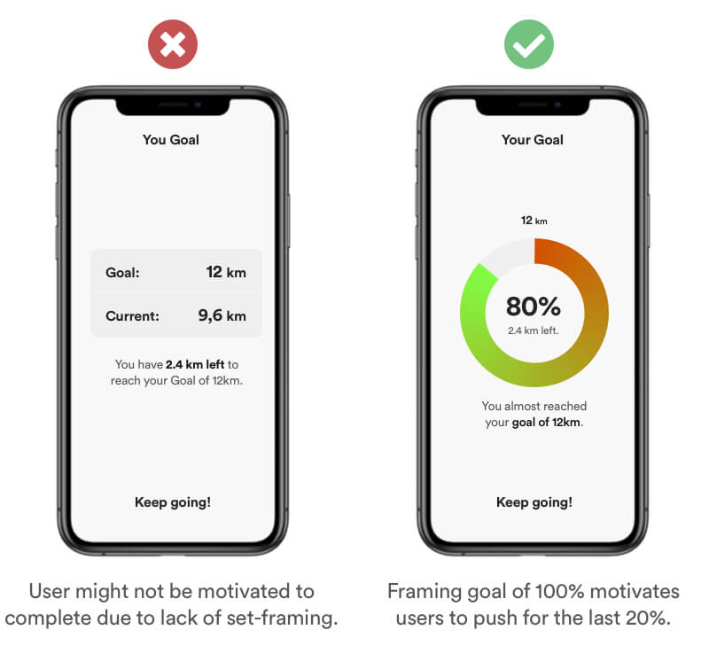
Tipps
- Set a specific goal a user can reach
- Group tasks in chronological order
- Use Numbers & Progress Bars to visualize progress
Definition
Scarcity is an economic concept and refers to the limited availability of a recourse in comparison to a high demand. A high demand usually triggers the users needs for that product. There are various forms of limitation like amount-limited, access-limited or time-limited.
Example
Be transparent with information and use positive scarcity to keep your users informed about the current status of the item stock. Don pressure your users into actions that are ethically wrong. Users will sense forced scarcity and this behavior might lead to a frustrating user experience and a bad reputation.
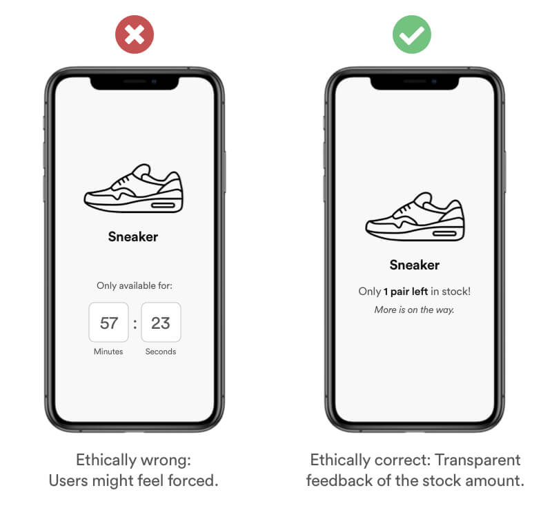
Real life Example
On some listings, Airbnb will display a message that this property is normally booked. This encourages quick bookings, and implies social proof.
Tipps
- Do not use this method to pressure your users
- Label limited or popular products.
- Products can be Amount-Limited, Access-Limited or Time-Limited
- Offer special and limited discounts or gifts as a reward for users using your product/service
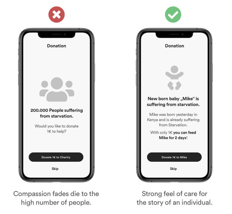
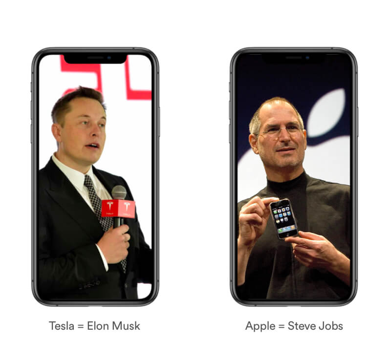
Definition
The Singularity effect represents the way of how we care disproportionately about an individual as compared to a group. Think of „Saving Private Ryan“ where an enormous effort was made to save a single soldier in world war. The addition of more people doesn’t increase the willingness to help proportionally. In fact our compassion even fades as more people are involved.
Example
Provide context and storytelling to help your users emphatize with your cause. Users tend to emphatize with the story of a single individual rather than a large group or organization.
Real Life Example
Who’s the first person that comes into your mind when I ask about the company Apple? And who’s the person that comes into your mind when I ask about Tesla Motors? If you though about Steve Jobs and Elon Musk you’re right. Because these companies use the singularity effect in benefit for their brand. People are able to emphatize with individuals rather than large companies.
Tipps
- Tell a story
- Use a protagonist users can relate to
- Use specific user or user feedback as a testimonial
Definition
Skeuomorphism refers to the use of visual elements that mimic real-world objects or materials, such as using a leather texture in a digital calendar app or making a digital button look like a physical button.
It is rooted in our familiarity with the physical world and our ability to quickly and easily recognize and understand objects based on their appearance and context.
Example
Skeuomorphism is based on the experience and believes of your users (Familiarity Bias). Using a 3D Model of a real battery makes the meaning to the user obvious.
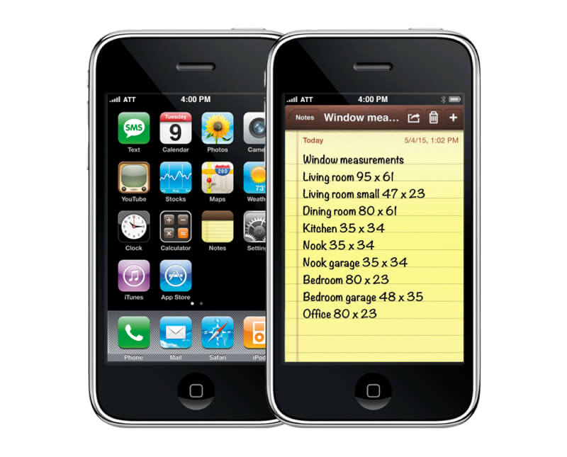
Real Life Example
Apple’s were known for the use of skeuomorphism in their iOS versions as a way to make their digital products more familiar to users who were used to physical objects in the real world. For example, the Notes app looked like a yellow notepad, the Calendar app looked like a physical calendar, and the Contacts app looked like a rolodex. This approach helped to bridge the gap between the digital and physical worlds, making it easier for users to understand and interact with their devices.
Tipps
- Use it only when it serves a purpose or functionality.
- Use it consistently to create a cohesive and seamless user experience.
- Avoid going overboard with skeuomorphic design.
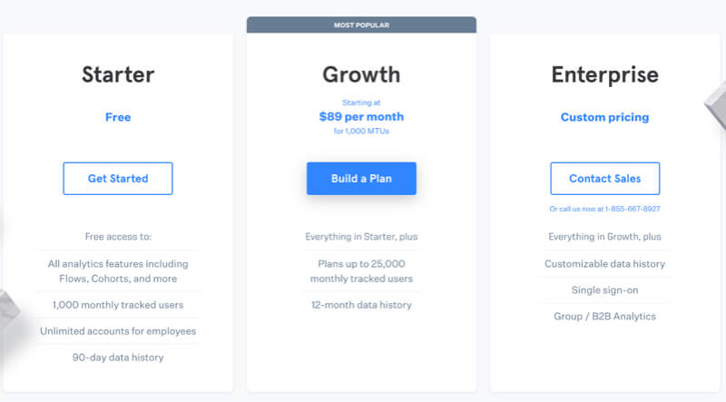
Definition
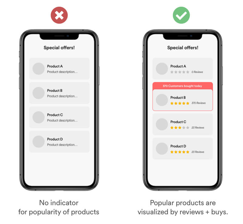
Social proof defines the idea that users copy the action of others in an attempt to emulate behavior and outcome in certain situations.
Example
Users tend to estimate the popularity of a product or service by the amount of people that bought it. If you have valid data, be transparent and show the ratings + review of your users. You can amplify the effect by using a badge that signifies the "Most Popular" product. Social proof increases trust in your brand.
Real Life Example
Be aware that you dont have control about your users feelings and that a bad review can have negative impact. In the example of the Facebook App, ratings dropped from a 4.7 down to a 2.2. due to user frustration with the service. Spotify on the other hand, doesn't provide any metrics about the popularity of shows or episodes.

Tipps
- Use authentic user generated content like ratings, comments & feedback
- If a decision has to be made, show which decision/product is the „most popular“ by users
- Motivate users to take action by showing them the number of users who already did it.
Definition
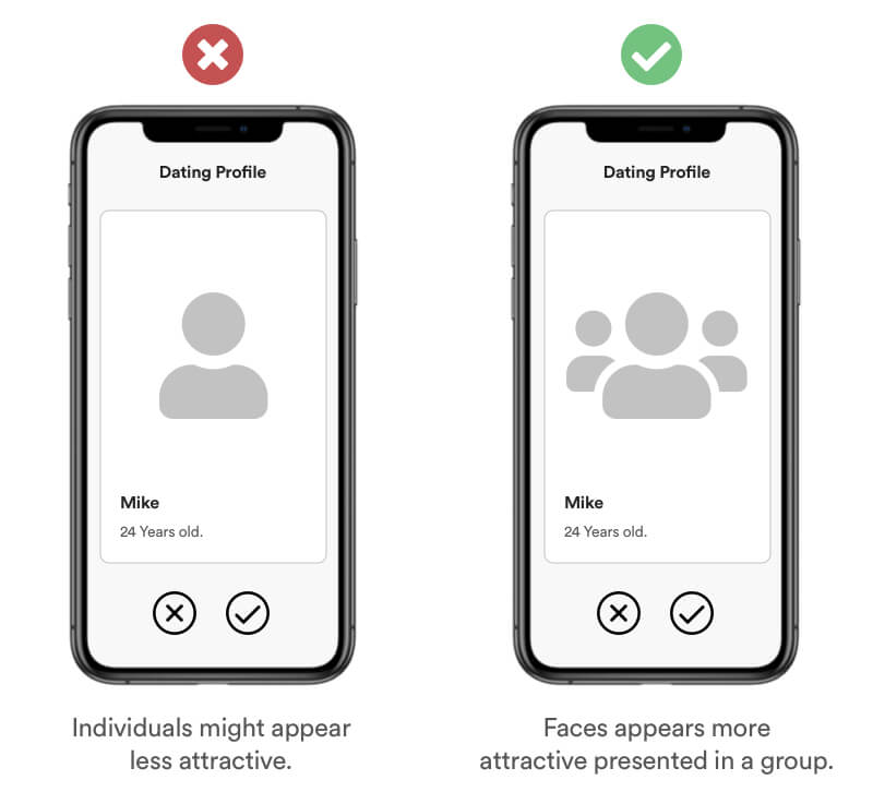
The Cheerleader effect (or Group-Attractiveness Effect) is a cognitive bias which causes users to think individuals are more attractive when they are in a group. This also goes for Information. The brat is interpreting a scene from visual information rather than analyzing details.
Example
Studies shown that faces presented in a group appear more attractive than when presented individual. You can use this technique to increase the attractiveness of your profile picture for example on dating plattforms.
Real Life Example
This effects also works on products. Did you notice – Fast Food Restaurants carefully placing other products around their specials Burgers to make them more interesting. Sometimes even priming Burgers in menus rather than showing the individual Burger.
Another Example: Apple is know for minimalistic presentation of their products. Yet if you pay attention you notice Apple taking use of the Cheerleader Effect. They often place another similar products around their focused product.
Tipps
- Group items carefully around your subject
- Create a scene for your subject
- Use similar items to avoid comparison
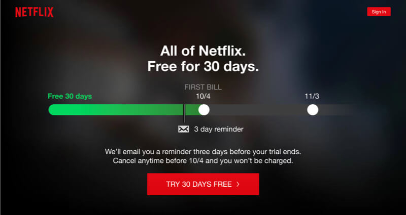
Definition
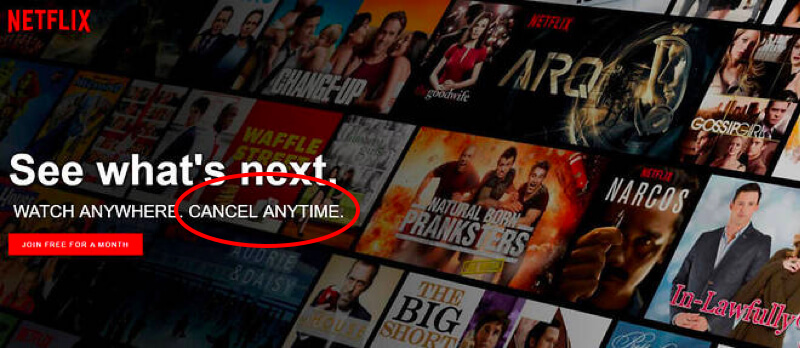
Humans have a natural desire to feel safe and secure. The Zero-risk bias is a method to eliminate any doubts with greater overall risk reduction.
Example
Show your users that you value their privacy and safety by adding visual elements that eliminate their risk.
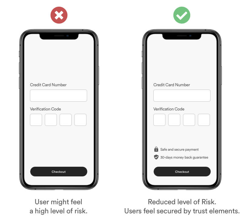
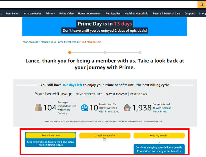
Real Life Example
Netflix is providing security by ensuring their users they can cancel their subscription every month.
Tipps
- Understand your users fears.
- Communicate your service standards and reduce risk.
- Communicate why you need critical data like Credit Card or Phone Numbers.
3. Act
Definition
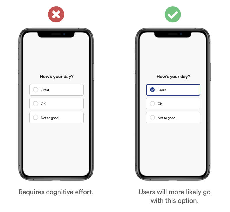
Without a compelling incentive to change, people tend to stick to the default suggestion, option or product. Making a decision usually requires cognitive effort, and it's easier for them to just accept the default option.
Example
When providing multiple options within your product journey, help users with default options to nudge them into the right direction. You can use data to personalise options for your revisiting users and their preferred behavior. Similar effect to „Nudge“.
Real Life Example
When browsing for 'repeat goods' (for example: Shampoo), Amazon will have their default option as 'subscribe and save'.
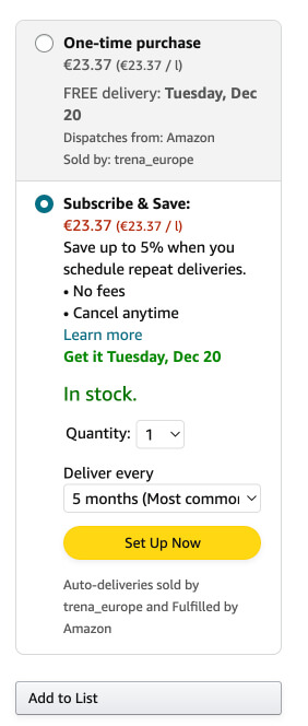
Tipps
- Add default options to your process.
- Defaults help your users get fast and easy to their goal – Anticipate their behavior with Default.
- Don’t use this method to manipulate your users.
Definition
Fitts's Law describes how long it takes for a user to hit a target in a user interface. The size and distance of the elements (for example a button) are important for the user to take quick action.
Example
Did you ever had to hold you smartphones with both hands to reach the menu Icon on top of an App and press it 3 times in a row until you hit the Button? That’s an example of how Fitt’s Law affects the usability. Interface Elements that are hard to reach or small decrease the usability for the user because he has to make an „effort“ to reach his target.
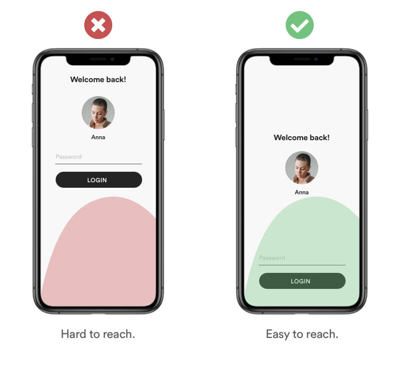
Tipps
- Design interactive elements to be large and easy to act with
- Place interactive elements where they are easy to reach
- Place interactive elements where they expected. For example a menu is expected to be on top
Definition
Gamification is the method of utilising elements of game playing (e.g. point scoring, competition with others, rules of play) to encourage engagement with a product or service.
Example
Gamification is an efficient and great method to make generic tasks feel engaging, rewarding and simply fun.
Real Life Example
Duolingo is a learning app with a concept build around gamification in order to make learning „fun“. They will use 'XP' (experience points) and 'streaks' to incentivise people to use their app more.
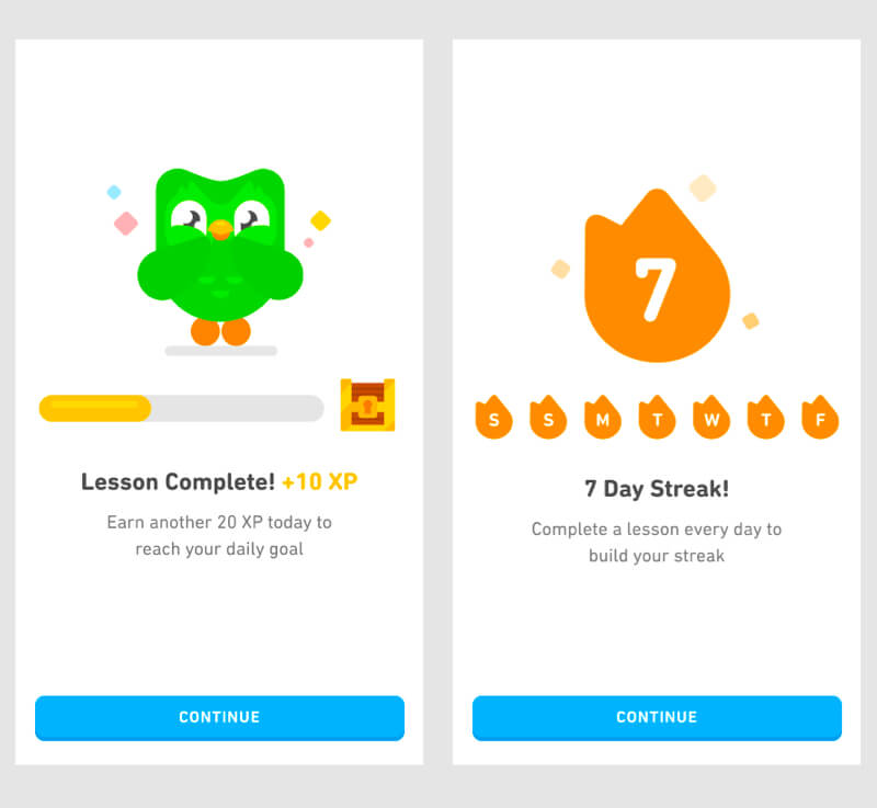
Tipps
- Focus on a delightful and playful experience.
- Reward users for reaching milestones or completing tasks.
- Add playful animations and interactions.
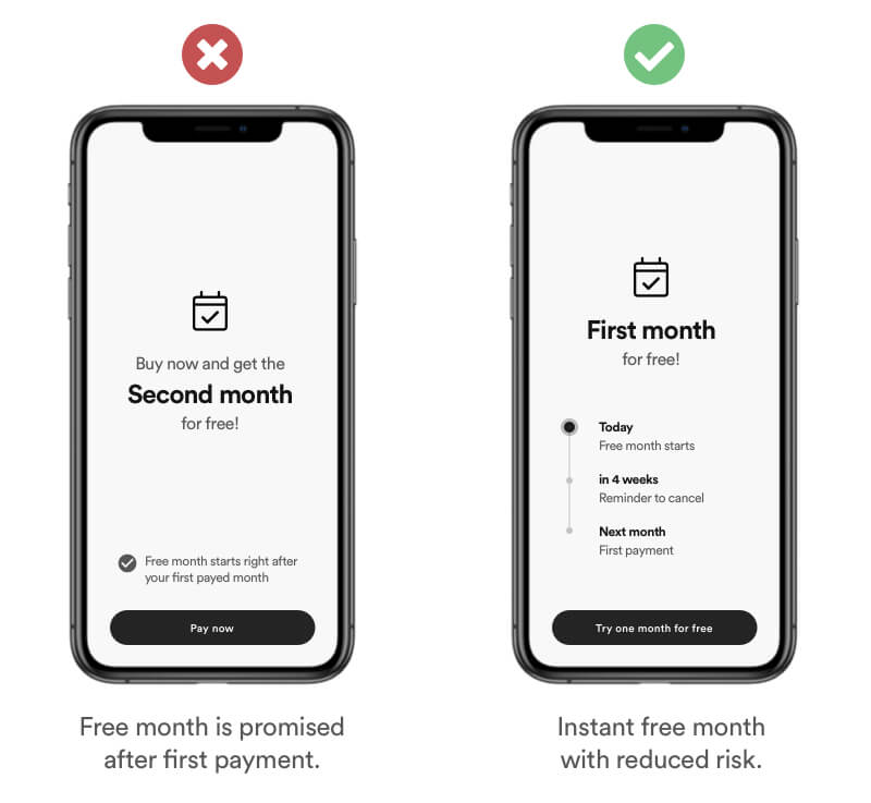
Definition
Hyperbolic discounting is a cognitive bias, where users choose smaller but immediate rewards rather than a large later reward. Basically the timing of the reward is more important than the reward itself.
Example
Giving instant access to a small reward right after a task is accomplished is more effective that promising large rewards later on.
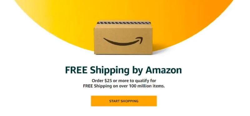
Real Life Example
Amazon gained popularity by granting free shipping for orders of 25$ and more. In addition every time you buy something offer you to upgrade to amazon prime by giving you instant benefits to it like e. g. Same day delivery.
Tipps
- Offer small rewards.
- The immediate accessibility of the reward is more important than the value of itself.
- Rewards motivate users to accomplish their tasks.
Definition
Users prefer not to lose something much rather than winning something. The value of losing something is higher than the value of getting. Similar bias to Scarcity.
Example
Describe your benefits in a way that makes your user feel of „not losing“ something rather than gaining. People usually don’t want more time, they just don’t want to feel they waste any of their time.
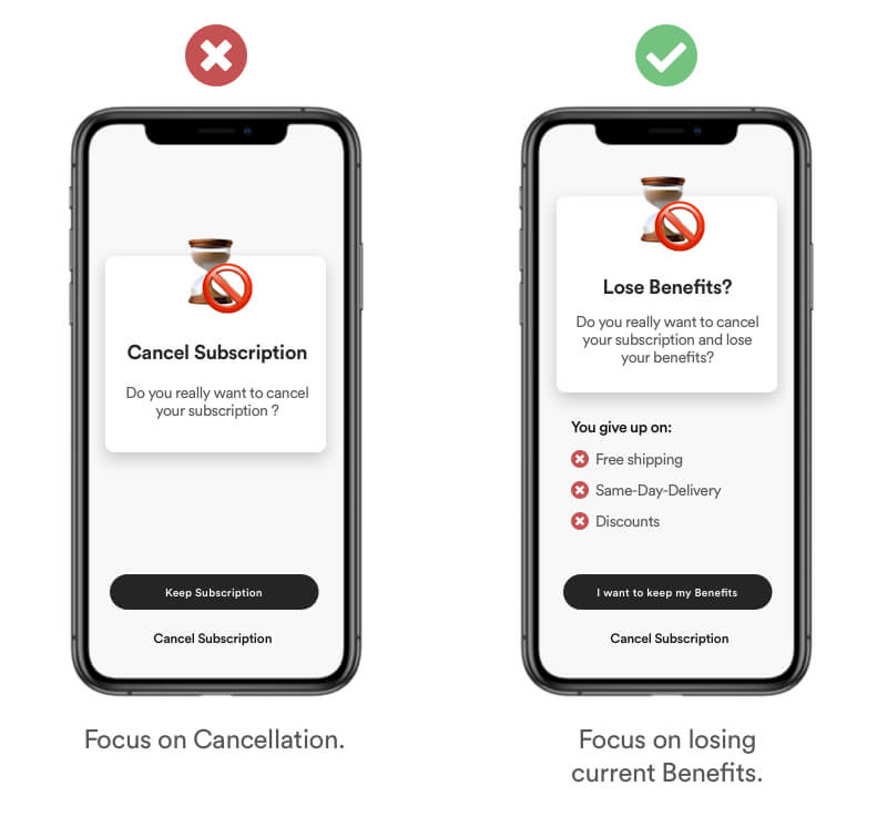
Real Life Example
Amazon Prime provides a lot of benefits for their prime customer. On the cancelation screen they focus on the potential loss of your personal benefits you gained throughout your subscription.
Tipps
- Focus on the users benefits.
- Express potential loss rather than potential gain.
- Use scarcity.
Definition
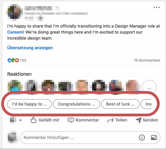
It’s a method to „nudge“ users into the right direction without forcing them. Small clues or context changes can encourage users to make a certain decision. Nudges are not mandatory and should be easy and cheap to avoid. You achieve this through Priming, Social Proof & Default Options.
Example
Use clever placed "nudges" to enourage users into a specific action. In this example I use a simple chat message. To encourage the user into replying I've added a "Write a message..." placeholder. In addition I've placed 3 buttons with default answers to nudge a response with only one interaction!
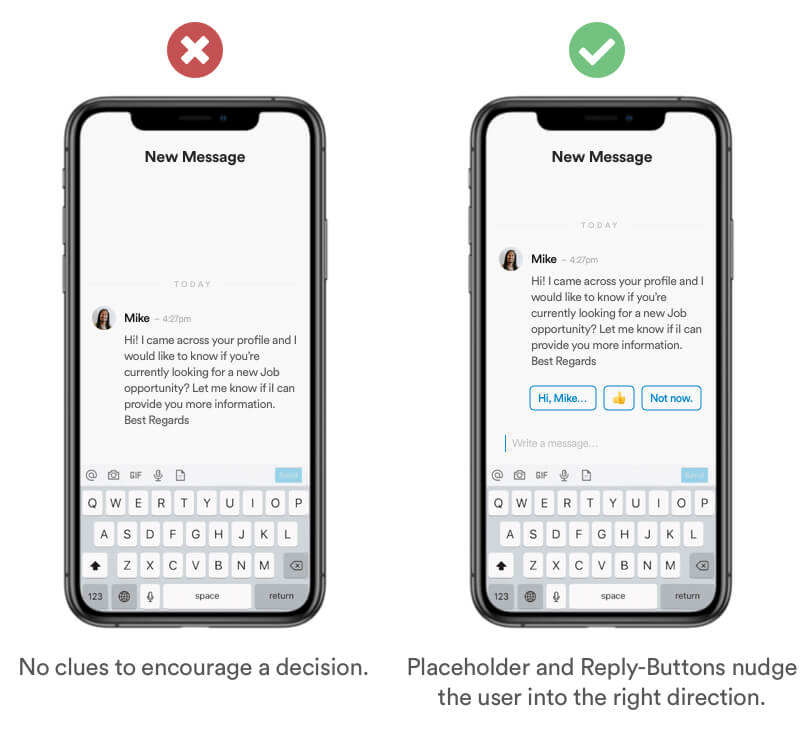
Real Life Example
Linked In makes a good job nudging users into reaction to posts by giving default messages as options.
Tipps
- Use default options
- Communicate clues
- Users need to understand the benefits quickly to have an internal motivation to act
4. Remember
Definition
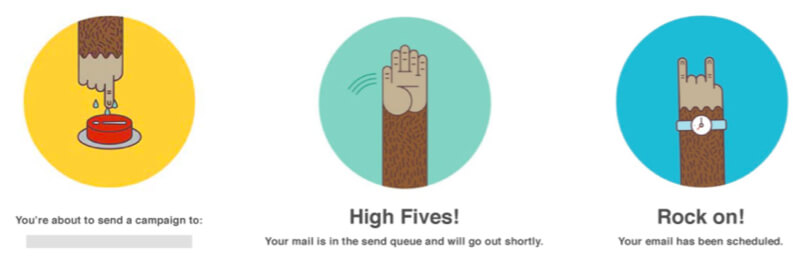
Users remember and respond favorably to small, unexpected and playful pleasures. I order to achieve a delightful moment you need to match your users expectations to be able to surprise him with a delightful moment.
Example
Add delighters that are playful and unexpected at crucial points in your user journey. A good example is to elevate your users feeling of success by adding storytelling into the end of a process.
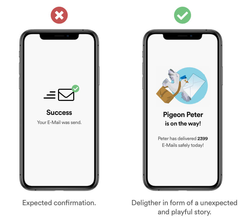
Real Life Example
Mailchimp has great deligthers throughout their user journey by using illustrations to add emotion to the process of sending mails.
Tipps
- Reward your users after or during a task.
- Delighter users AFTER basic expectations of the product/service are met.
- Delight with playful interactions, illustrations or hints.
- Can have a negative impact when basic expectations are not met.
Definition
The endowment effect describes how people tend to value items that they own more highly than they would if they did not belong to them. This means that sellers often try to charge more for an item than it would cost elsewhere. This bias occurs when we overvalue something that we own, regardless of its objective market value.
Example
Hook your users by offering benefits as soon as possible rather than causing friction when a users first encounters your product.
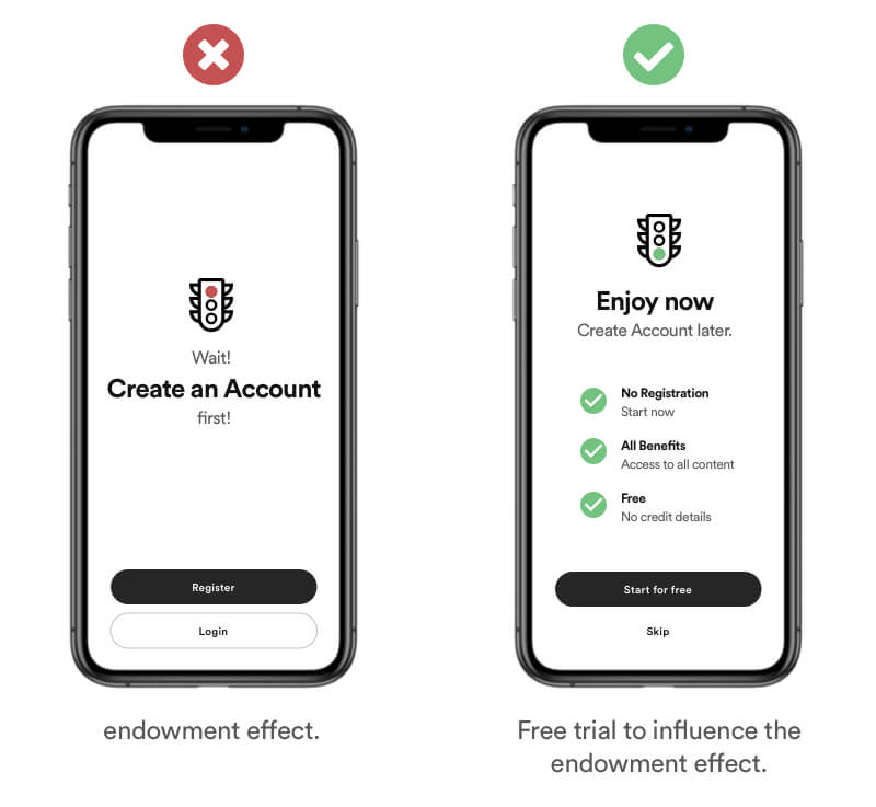
Real Life Example
This cognitive bias is one of the reasons why free trials are often so effective. People invest time into their account (e.g., profile pictures, setting themes and colours), and then they don't want to lose access to the benefits that they have gained.
Tipps
- Offer trials.
- Reduce barriers and friction.
- Personalisation/Customization increase the feel of owning.
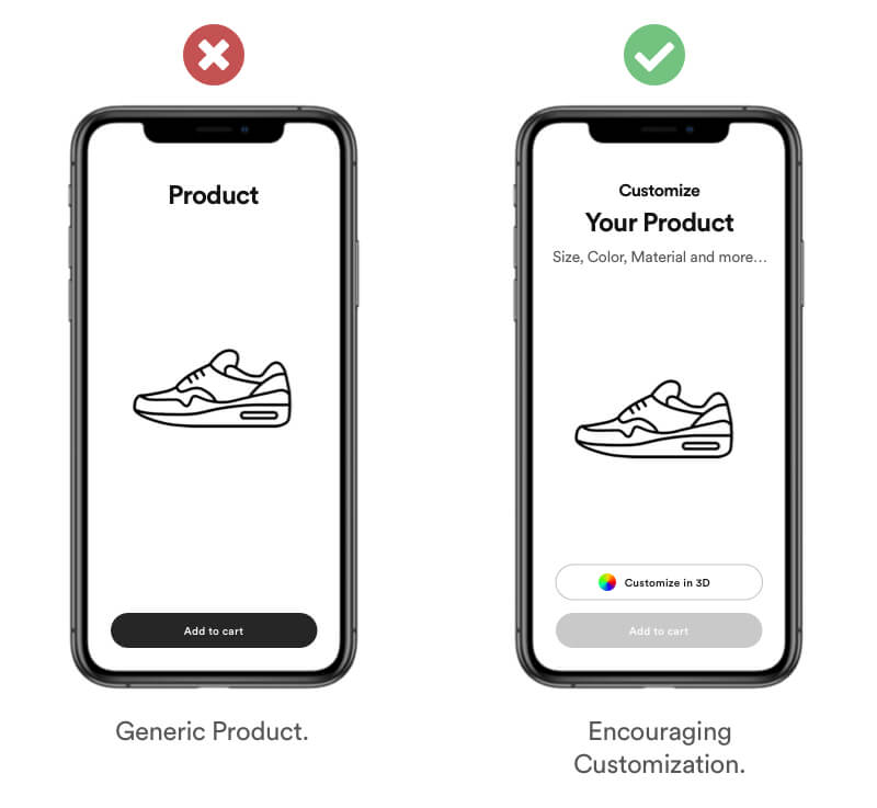
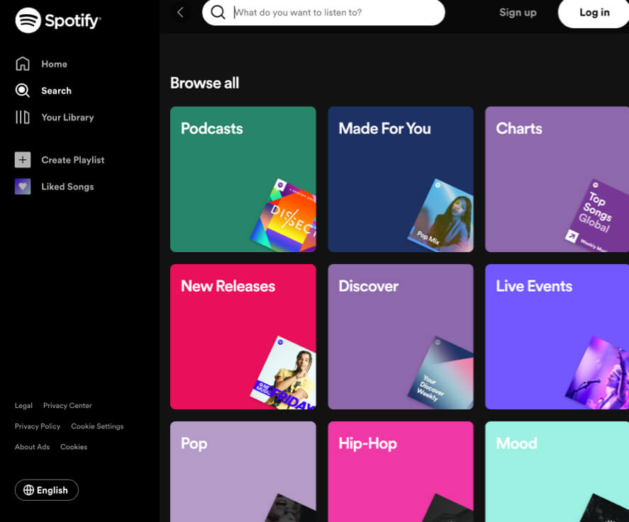
Definition
The IKEA effect describes a cognitive bias that happens when we work to acquire a product, complete a project, or finish a creation. It says that we tend to overvalue things that we are involved in making. The name also refers to Swedish manufacturer and furniture retailer IKEA, which sells many items of furniture that require assembly.
Example
Encourage users into customizing or editing inside your product in order to give them a feel of finishing something themselve.
Real Life Example
Spotify encouraging new users to create their own playlist. This is sticky, because once users have curated their favourite songs, they won't want to lose those playlists forever. This can decrease churn when transitioning into a subscription.
Tipps
- Encourage users to create something.
- Allow customization of your products.
- Give users creative freedom.
Definition
Labor Illusion is the phenomenon that states, when users engage with websites they are more willingly to endure longer waiting times when they can actually see that effort is being made in expectation of better results.
Example
When your product/service have waiting time, make sure to add clear visual feedback that work is being done in order to give your user a good feeling. In addition you can provide additional information that indicates the progress and the estimated waiting time.
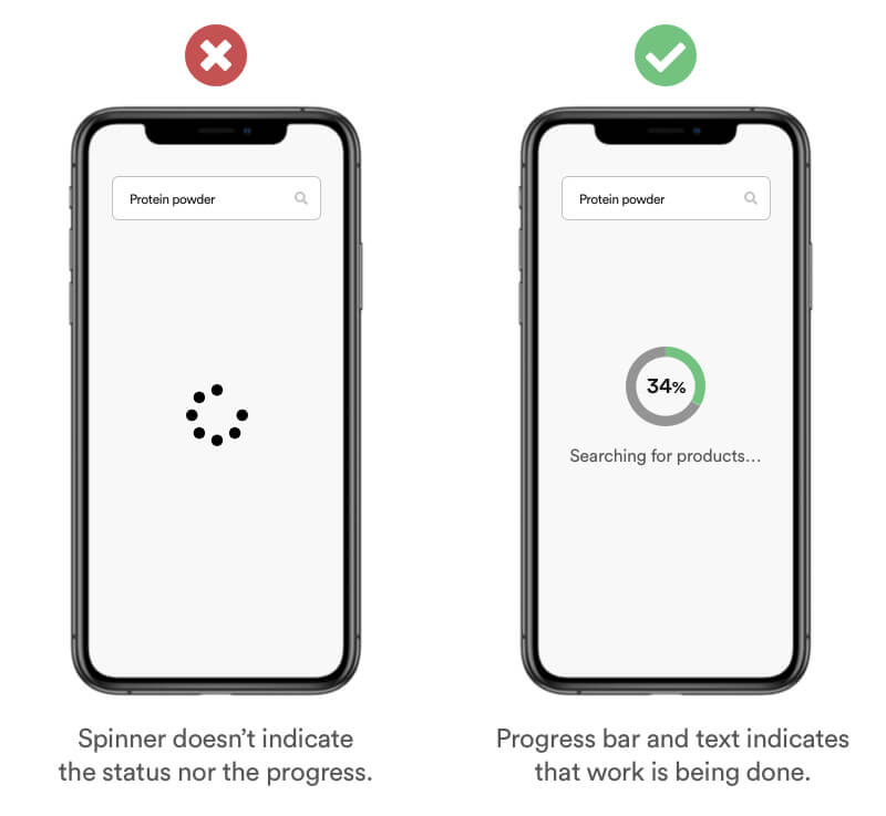
Real Life Example
Most online games have a waiting time before players are found for your match. Overwatch for example shows you only how long you are waiting. But the user is left without any process or visual information about the status. A better solution would be to display the status about the players that were already found. With this information users tend to tolerate longer waiting time if they see how many players were actually found.
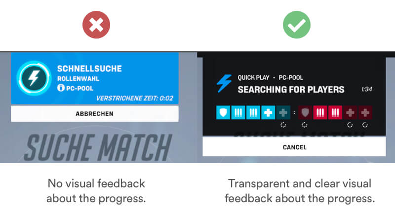
Tipps
- Add visual Indicators.
- Show that work is being done.
- Display information about the process.
- Caution: Can expose a flawed process and have a negative impact.
Definition
Most user will remember the negative moments better than the good ones. Negative experiences tend to affect the human memory 3x more than a positive one. 1 bad experience = 3 good experiences.
Example
You can catch your users attention by framing the benefits of your product/service in describing to solve a problem or a bad experience.
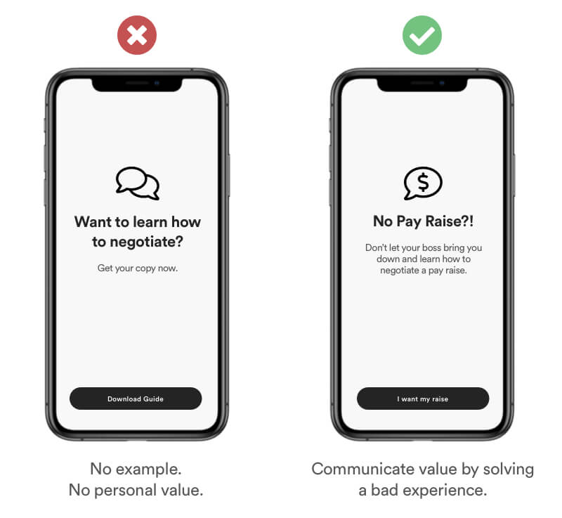
Tipps
- 1 negative emotion = 3 positive emotions.
- Show how your product/service solves negative experiences.
- Start with a question.
Definition
Social comparison bias is the tendency to have feelings of dislike and competitiveness with people who are in some way perceived better than you. This competitiveness can motivate you to improve yourself and set higher standards.
Example
Adding competitiveness into products can improve the motivation. Make sure you are transparent and let the user be able to compare his performance with others.
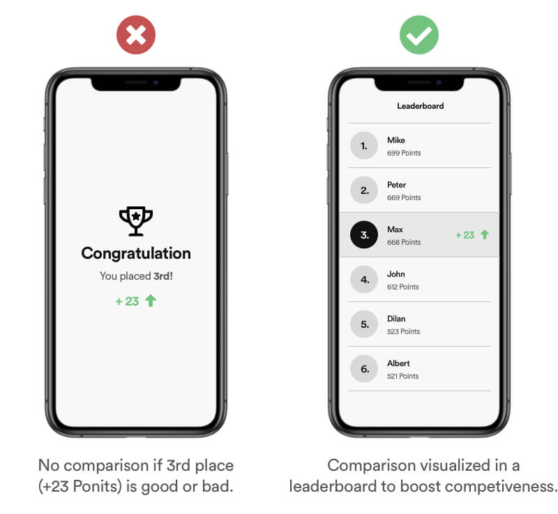
Real Life Example
Nike for example uses scoreboards to motivate users challenge each other to run more. This has a positive impact not only on the mental strength, running is also a healthy workout. Duolingo is a learn app which split their scoreboard into leagues to add a factor of competitiveness.
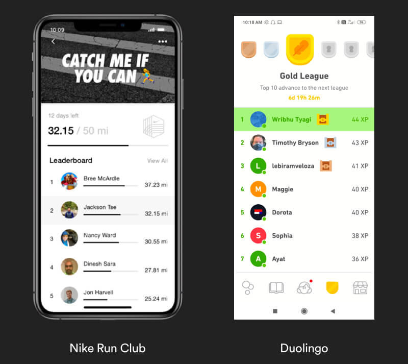
Tipps
- Add Leaderboards.
- Let users compare their performance/progress with others.
- Bad implemented social comparison can have a negative impact and cause frustration.