4 UX Improvements for Overwatch 2.

A personal UX/UI case study exploring four improvements for a more transparent, customizable and rewarding Overwatch 2 experience.

Overwatch 2 case study hero mockup
Role
UX/UI Design
Year
2022
Type
Personal Case Study
Focus
Gaming, Engagement Systems, Progression

Project Snapshot

After getting access to the Overwatch 2 beta, I challenged myself to identify focused UX opportunities that could improve the player experience without redesigning the entire game. The result is a set of four concepts that use player-centered design, UX psychology and interaction design to improve clarity, feedback and satisfaction.

Overview

UX Improvement 01

Searching for a Match

The first improvement begins before you even play the game. Usually you have to navigate through an in-game menu to the point where you can click on Quick Play. After that you choose a role, and confirming that role throws you right into the match search, which is visualized by a modal at the top of the screen.

Current Experience
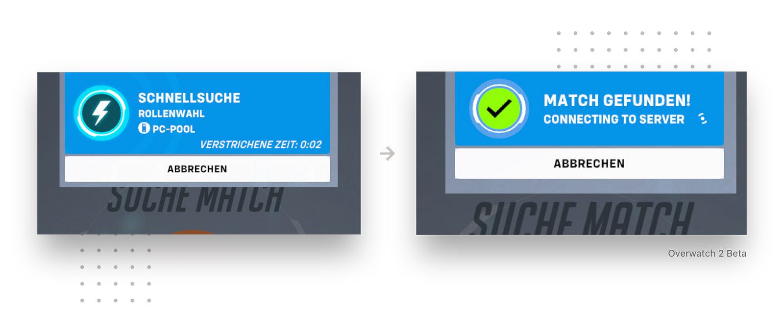
Current Overwatch 2 matchmaking queue state

The modal shows the game mode, your device and your live queue time. After finding a match, you get short “match found” feedback that throws you automatically into a match after 2–5 seconds. So what are the main problems here?

Problems

No visual progress

As a user, you do not get information about the progress being made, which can leave you frustrated and bored.

No confirmation

Queue times can go up to 5, 10 or 20 minutes. In some cases you might miss the match because you are not asked if you are ready.

Question

How can we optimize the modal and reduce the risk of players not being ready?

Design Psychology

Labour Illusion

Users tolerate waiting better when they can see that work is being done.

Solution

Solution

The idea was simple: make the invisible waiting process visible. I wanted the modal to show that matchmaking is actively moving forward, not just count the time a player has already spent waiting.

01
Visible progress

The queue shows active search movement instead of only elapsed time.

02
Ready Check

A final confirmation protects players who briefly look away.

The “Labour Illusion” describes how people tend to value a service more when they can see the effort being made for them. In this case, the problem was not only the waiting time itself, but the fact that the player has almost no sense of what is happening during that wait.

That means I focused on transparency. I wanted to visualize the current status, the roles already found and the roles still missing, so the queue feels like an active process instead of a passive timer. By showing progress, the interface communicates a stronger feeling of care and gives players a clearer reason to keep waiting.

I also swapped the automatic “match found” moment with an “Are you ready?” overlay. After a 5, 10 or even 20 minute queue, it is realistic that a player might look away for a second. Asking for confirmation gives the player one last moment of control and reduces the chance of being pulled into a match while they are not actually ready.

Benefits

Transparency

Our users now get information about the progress being made and the status of how many players and which roles were found or are still missing.

Availability

By actively clicking the ready button, all users agree to start the match and there is no chance games are missed or closed due to inactivity.
UX Improvement 02

Scoreboard

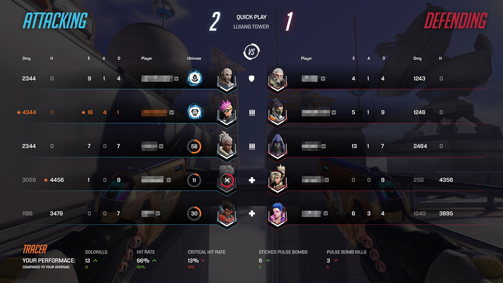
Compared to the original Overwatch, where you had no scoreboard at all but only an overview of the teams, their ultimate charge and your individual performance, Overwatch 2 made a step into the right direction by making individual performance available for everyone on a scoreboard.

Current Experience

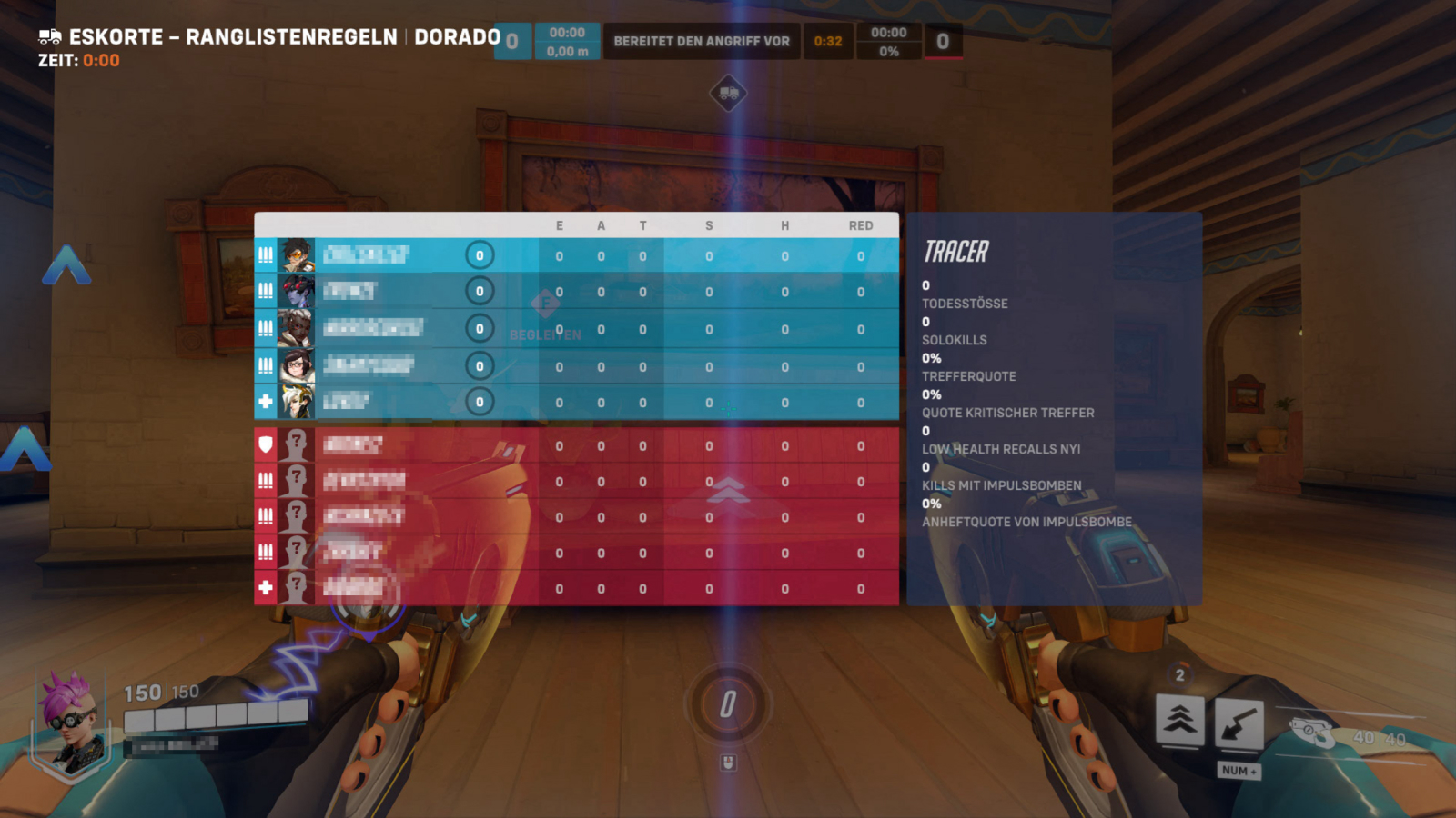
Current Overwatch 2 scoreboard state

Keeping in mind that the screenshot is from the beta, the UI can still change completely before the official release. Nevertheless, I think we can still make some improvements here. So what are the main problems here?

Problems

Hard to scan

Users have to make a cognitive effort to filter the information they need, which wastes valuable time.

High cognitive load

Depending on the size of the user’s device, readability can be limited due to small text sizes and squished information.

Question

How can we increase the discoverability and readability?

Design Psychology

Discoverability

Interfaces are easier to use when important information and actions are visible, grouped and easy to interpret.

Solution

Solution

My focus was to make the scoreboard easier to read in the few seconds players actually open it. The most important information needed to move closer to the player’s natural focal point.

Redesigned Overwatch 2 scoreboard concept
Hierarchy
Teams read first

Grouped rows create an instant sense of who is performing and where to look next.

Comparison
Stats line up cleanly

Aligned columns reduce eye travel when comparing teammates and opponents.

Focus
Center carries the match state

The most important score context becomes the visual anchor.

Discoverability, in the context of product and interface design, is the degree of ease with which users can find all the elements and information of a new interface when they first encounter it.

Overwatch is a very fast game. Tabs are opened for only a few seconds to scan information and proceed with the match. In order to verify which information is most important, I created a poll and asked people.

I created a poll and, based on the comments, came to the conclusion that most people insist on the scoreboard. I also noticed that users want information about ultimate charges and heroes being played. A look in the comments showed that players want an “Overwatch 1 version”, which simply shows individual performance for their hero too.

My focus was to regroup the information around the user’s focal point, which is centered around the crosshair most of the time. That way I can reduce the effort a user’s eye has to make.

I used the full space of the screen and created a centered, symmetrical scoreboard. The focal point represents the most important information like role, hero picks and ultimate charge. On the outside, you have secondary information like eliminations, damage, personal performance and hero statistics at the bottom.

Benefits

Readability

With a centered design, we can display all relevant information the user needs. With the most important information grouped around the focal point, we reduce cognitive effort.

Comparison

Increasing the font size and removing background colors reduces cognitive load and creates higher contrast, making the information easier to read.

UX Improvement 03

Ban Phase

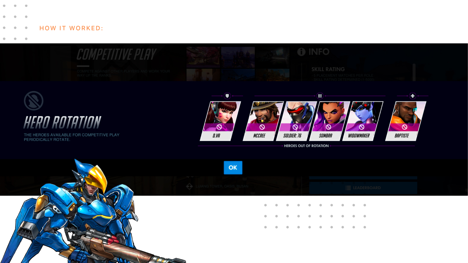
In 2020, Blizzard attempted to introduce bans to the game. Once a week, a couple of heroes were banned from competitive modes and could not be picked for a week. The bans were determined by Blizzard only. The idea behind that feature was to ban heroes with a high pick rate to motivate players to play other heroes.

Current Experience

Current hero ban phase context in Overwatch

What seemed like a step in the right direction brought some challenges. For example, this particular week heroes like McCree, Soldier: 76 and Widowmaker were banned. Those heroes were three of the four most powerful hitscans in the game and direct counters to the flying hero Pharah, who has high damage output. This week in particular was extremely Pharah dominated because of the lack of proper hitscans available, which made it very frustrating for players having to play against Pharah every match for a week. So what are the main problems here?

Problems

Customization

Users give more value to experiences they are able to customize. Being thrown into new circumstances without a say might cause frustration.

Time

Banning heroes for a whole week caused more frustration than flexibility because users were stuck in new circumstances they did not vote for.

Question

How can we rethink the idea of hero bans and involve the user at the same time?

Design Psychology

IKEA Effect

Users give products and services higher value if they created them themselves.

Solution

Solution

The idea was simple: let the users decide themselves. Instead of making hero bans feel imposed from outside the match, I wanted players to shape one part of the match setup together.

Before
Forced rotation

Hero restrictions can feel imposed and disconnected from player intent.

After
Shared ban vote

The team gets a focused moment to influence the match setup together.

The idea was simple: let the users decide themselves. For example, during the draft, teams are trying to build a winning strategy by choosing the right heroes throughout the game. This is a balancing act between trying to predict and react to the strategies and hero picks of their opponents.

In addition to that, I want to add another layer of strategy and flexibility. Before the picking phase, every team starts with a Ban Phase in which you can vote one hero out of the pool to be banned for the whole match.

I do not only want players to pick the same winning composition. I want them to be flexible and strategic. I want to give them the power to ban heroes from a match. This ban phase can be used to ban counter heroes, give your team an advantage or strategically sabotage the enemy team. The goal is to give players the power to customize their matches to a level where every match feels like a new challenge.

Benefits

Feel of impact

With more freedom to customize matches, users get a “feel of impact”. This leads to more responsibility, which increases the experience.

Flexibility & Democracy

Not knowing which hero the enemy team might ban makes matches unpredictable. Therefore, every match feels unique because users have to adapt to the circumstances they created themselves through voting.

UX Improvement 04

Match Summary

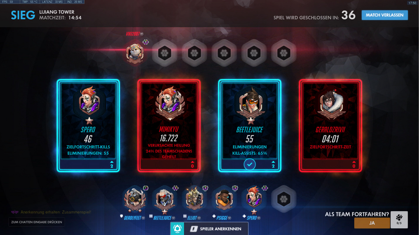
The beta of Overwatch 2 has no match summary yet, so I focused on the current Overwatch 1 match summary. The core screen of the summary displays what users call cards. Those cards represent the best performers of both teams in a match. They can represent the highest damage compared to the rest of your team combined, or individual stats like objective time and MVP.

Current Experience

Current Overwatch match summary card screen

In addition, every player can vote for a card. Cards with 5 or 10 votes are highlighted with audiovisual feedback. It is a great delighter for playing the game. Yet, the votes have no effect on your profile or further game quality. You also have the ability to find features that give players endorsement votes for teamwork, leading and communication. This is shown in the profile, but it is barely used. So what are the main problems here?

Problems

Social quality gap

Metrics focus only on complex statistics and completely miss the social factor. How do players feel about their teammates’ performance?

Scoreboard

It is a team-based game, yet we currently only see four of the best players of the match. How did the rest perform?

Question

How can we add feedback features that reflect players’ social qualities?

Design Psychology

Social Proof

People understand value through visible signals from other people and the group around them.

Solution

Solution

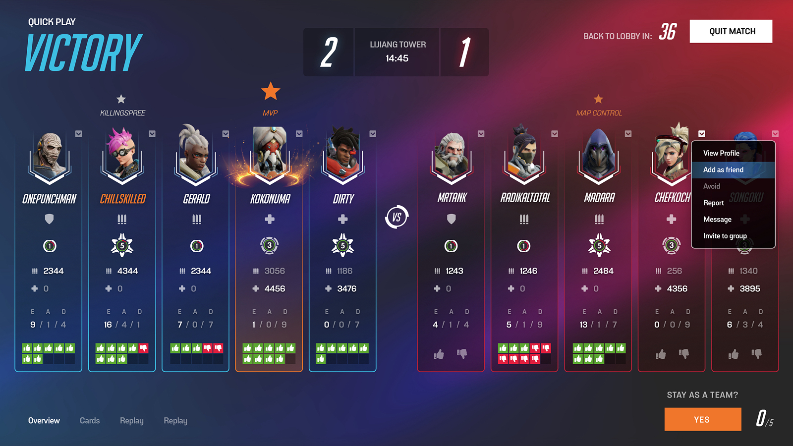
The goal was to make the end of a match feel more complete. I wanted the summary to show performance, but also the social qualities that make a team-based game enjoyable.

Redesigned Overwatch match summary concept
Team Contributions

More contribution types become visible.

Player Feedback

Team appreciation turns stats into meaning.

Meaningful Progress

The ending creates a reason to queue again.

Humans are social creatures, and the game is based around playing in a team. While the current summary focuses only on performance as a metric, it was important to me to add a feedback function that gives players the ability to communicate how satisfied they were with their teammates.

In addition, I do not want to highlight only the three or four best performers. It was important to present all participants visually equal with their individual game stats. While there are best performers, a whole team adds to the factor of losing or winning.

These are the three core elements I focused on: scoreboard, MVP stars and a social system. Like previously mentioned, I did not want to spotlight only three or four players. A win or loss is a team effort. Therefore, it was important to show all players and their performance at the end of a match in order to keep transparency among all participants.

I removed the cards and added stars instead as visual feedback for the MVP in the game. The most important metric in a team-based game is how well you worked around your team. That leads to a social system: “How well was your communication?”, “How well did you protect your teammates?”, “Did you adapt to your team’s strategy or were you a lone wolf?” These are questions that are hard to measure. Therefore, it was important to add a feedback function that supports the psychological effect of social proof for future games.

Benefits

Social Comparison

Social comparison increases competitiveness with people who are better. This competitiveness can motivate people to improve and set higher standards.

Social Proof

I want to give people the ability to rate participants in order to add an element of social proof to the game. This way we can add a social factor based on standards the community can set themselves.