Questions
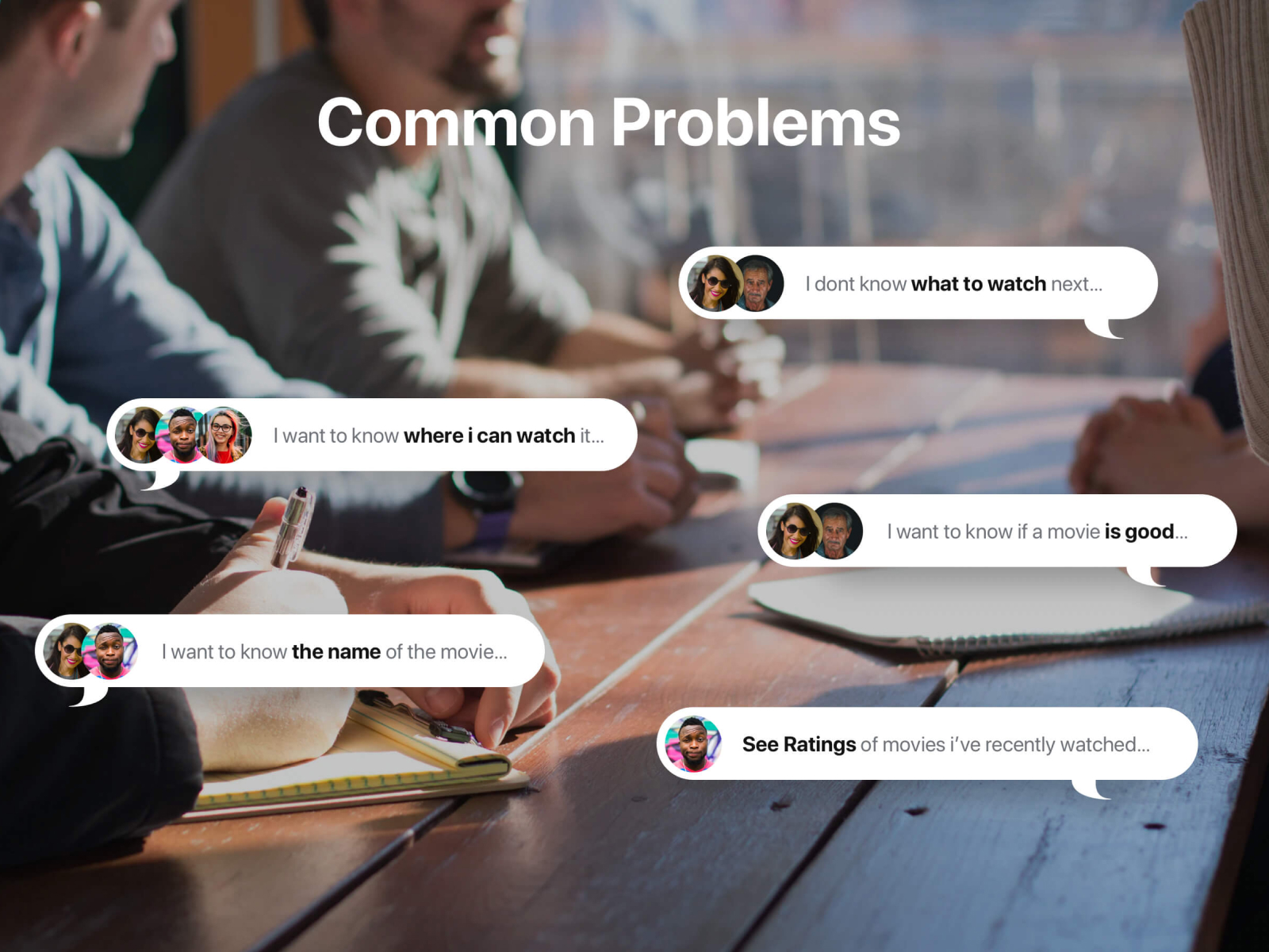
- What should I watch next?
- Where can I stream it?
- Is this movie actually worth watching?
- What movie was that clip from?
- What did I recently enjoy?
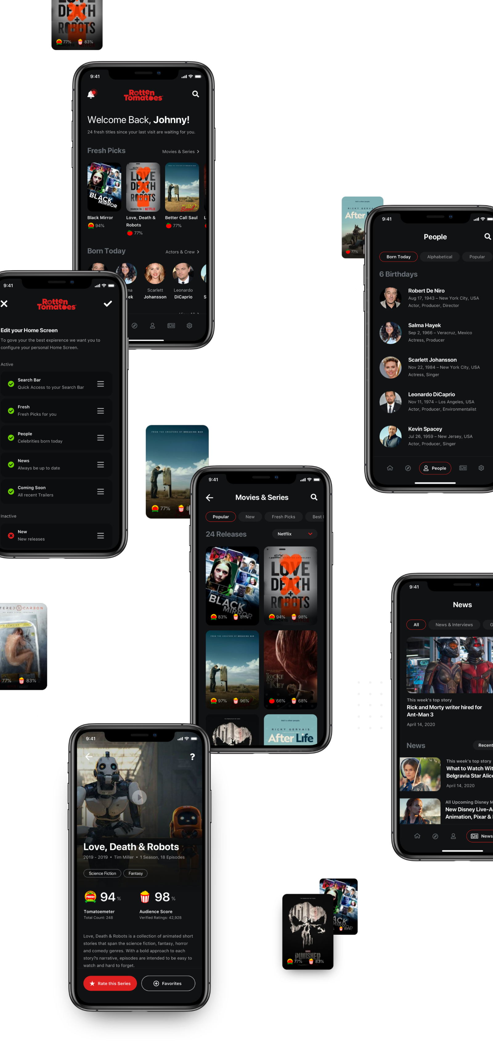
A mobile app concept exploring how Rotten Tomatoes could help users discover what to watch, understand ratings and find where titles are available to stream.
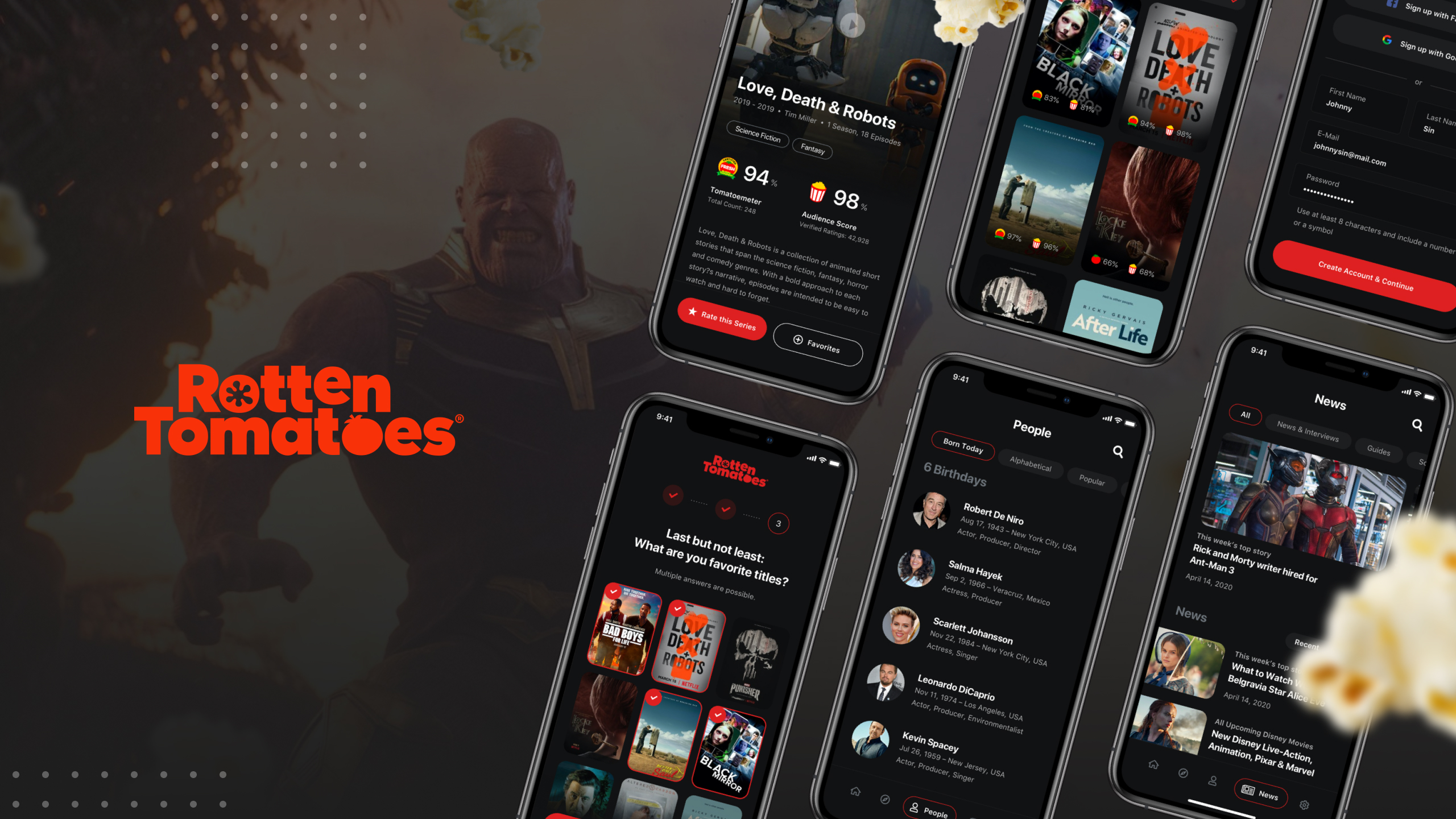

This concept reimagines Rotten Tomatoes as a mobile-first discovery tool. The goal was to move beyond ratings and create a product experience around decision-making, streaming availability and personal recommendations.
Challenge
Users often know they want to watch something, but struggle to make a confident decision. The research showed that people do not only need more content. They need context.
Questions
Process
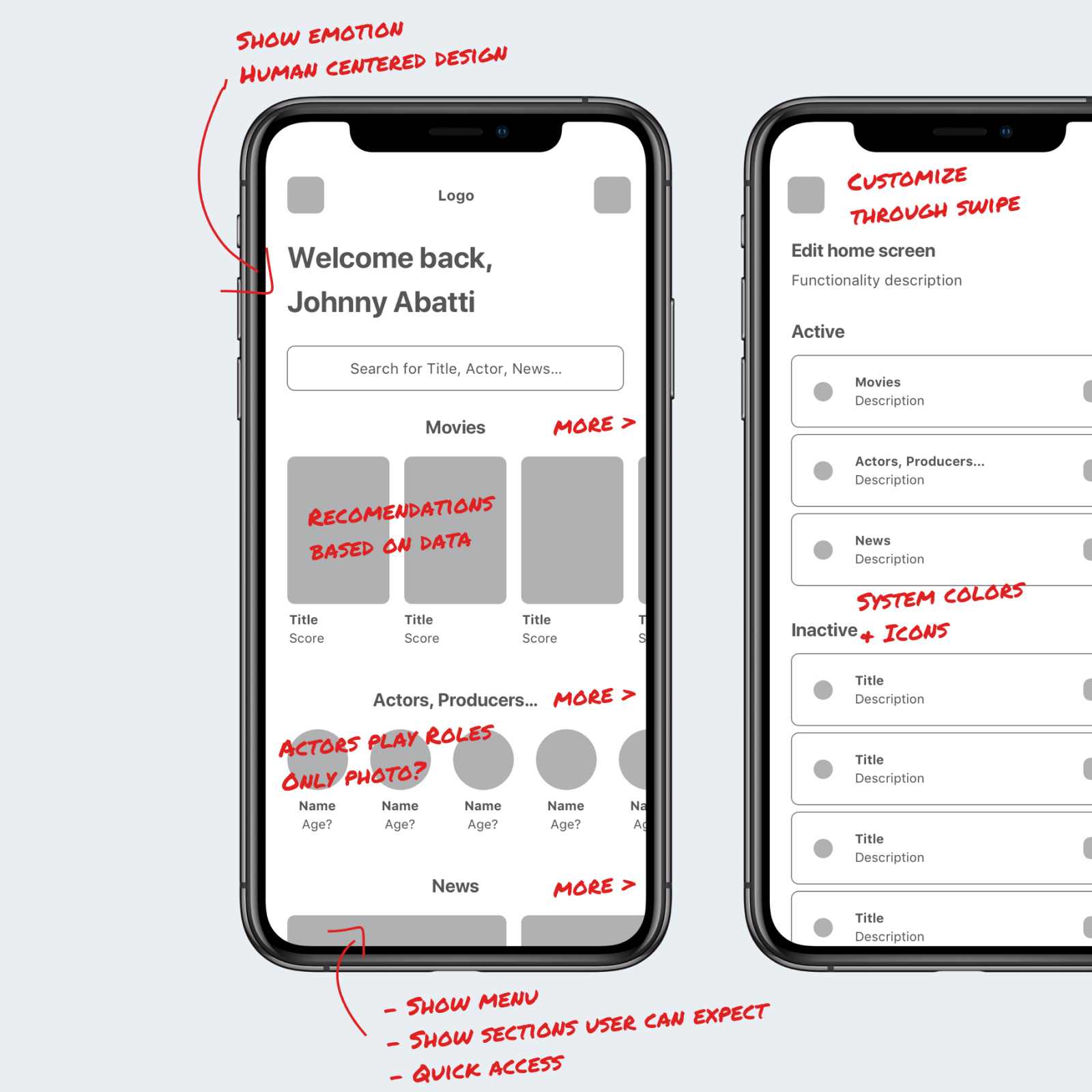
I started with wireframes to define the information architecture, navigation and core product modules before moving into high-fidelity UI design. The early structure focused on recommendations, ratings, search, streaming availability and personalization.
Solution
The concept is built around five product areas that make movie discovery more personal, useful and actionable.
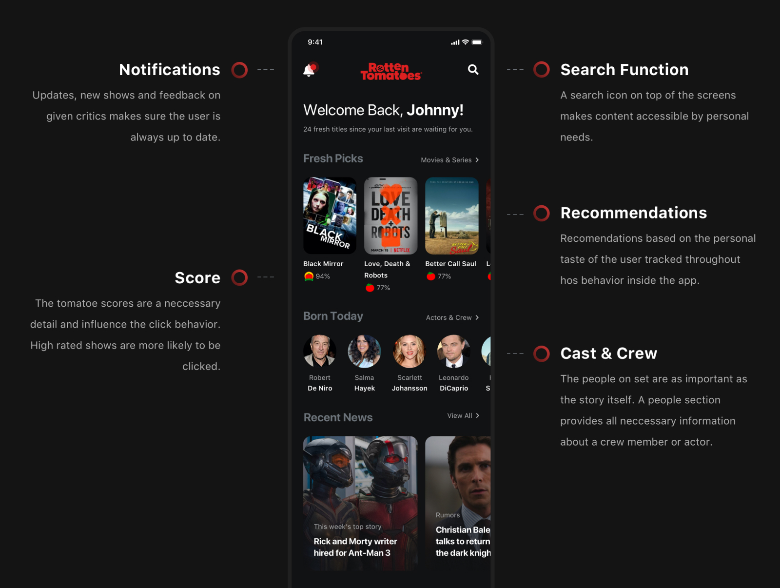
A customizable home feed lets users prioritize the content modules that matter most, from fresh releases and recommendations to cast, crew and recent news.
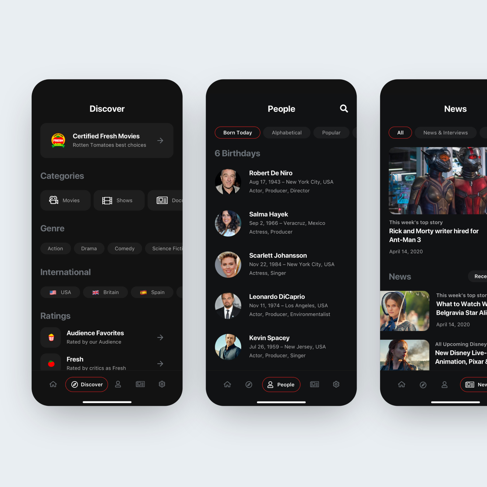
A dedicated discovery area helps users browse titles by genre, country, ratings and personal preferences instead of relying only on search.
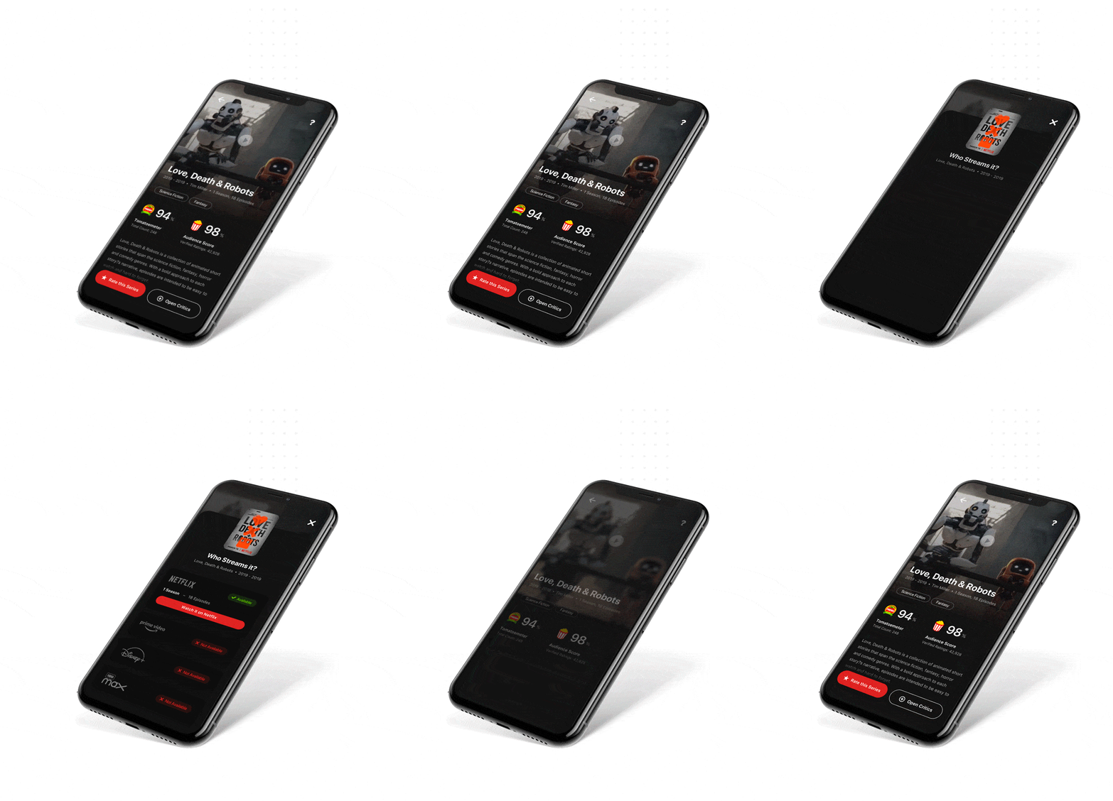
After finding an interesting title, users can immediately see where it is available to stream, reducing the frustration of switching between platforms.
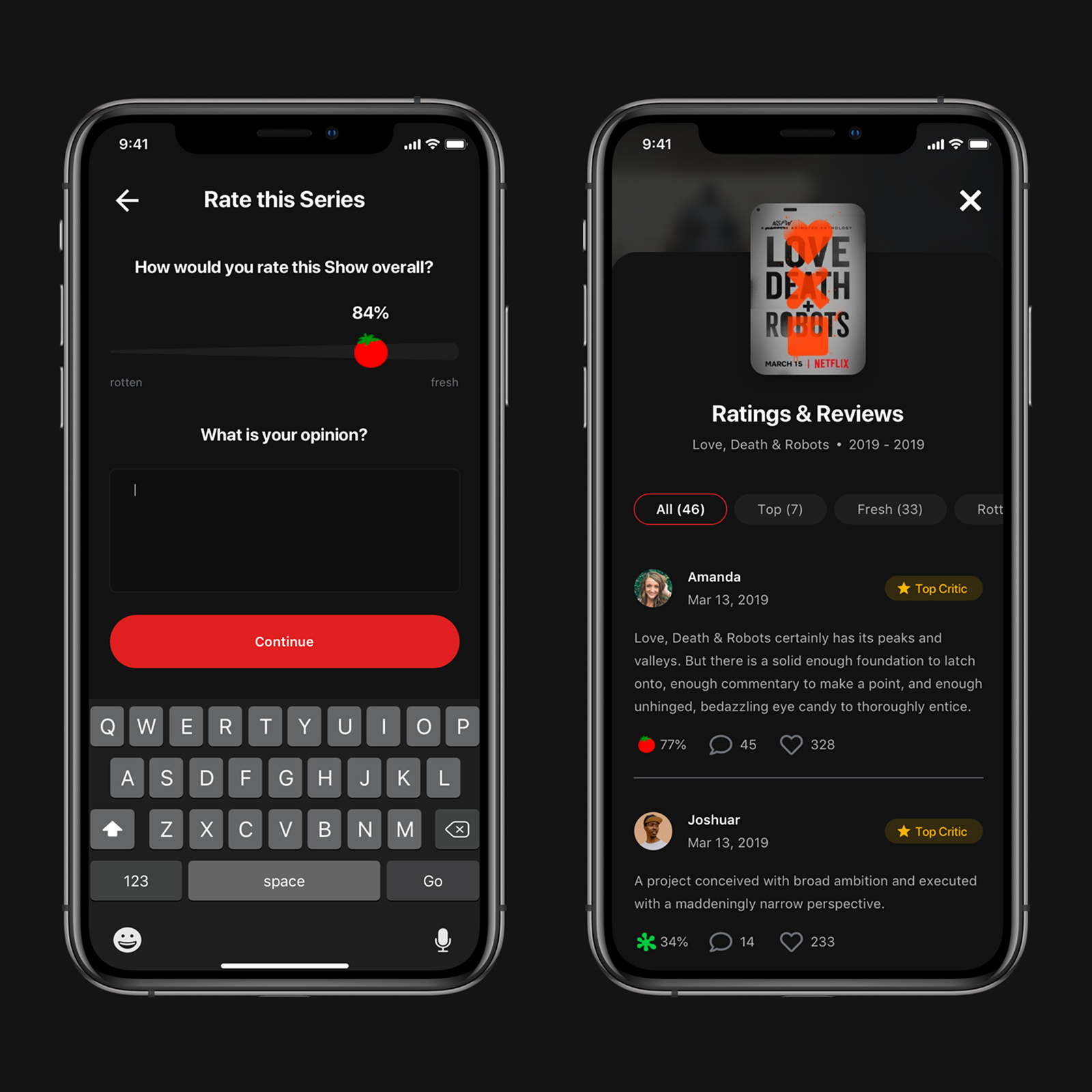
Audience scores, critic ratings and community reviews are combined to help users make a more confident decision before watching.
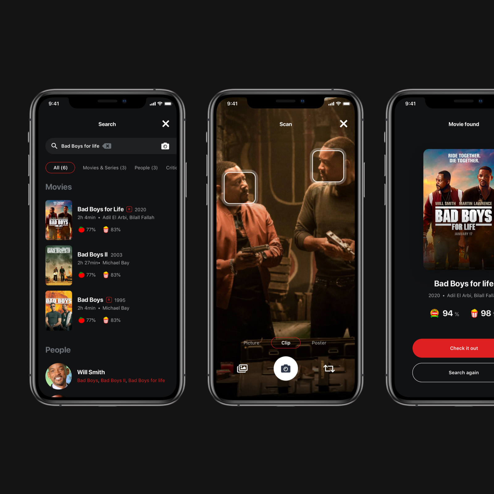
A visual search concept allows users to find movies through images, clips or screenshots when they remember a scene but not the title.
Visual Design
The interface uses a dark, cinema-inspired visual language to keep attention on movie content, ratings and primary actions. Red is used as a strong Rotten Tomatoes brand accent for important moments.